
In the web we navigate today, fonts have become almost as essential as images. It is rare to come across a site that does not use its own font sets, regardless of its business.
However, let’s be clear: this negatively impacts loading times. Let’s look at the mechanisms that make using online hosted fonts costly, and how it is possible to optimize the process to meet user expectations.
Why do fonts weigh down performance?
A web font is a file that must be downloaded before the text can be displayed in its final form. Until it arrives, the browser displays a fallback font or nothing at all. Each weight and each style is a separate file, which quickly multiplies the weight and the requests.
Fonts have become a form of expression in their own right in website design. They are used to convey a company’s visual identity and help strengthen its brand image.
Through its serifs, kerning, or line spacing, each font reflects a site’s values and informs users about its intentions. This is why a financial services company and a leisure company will generally not turn to the same typography.
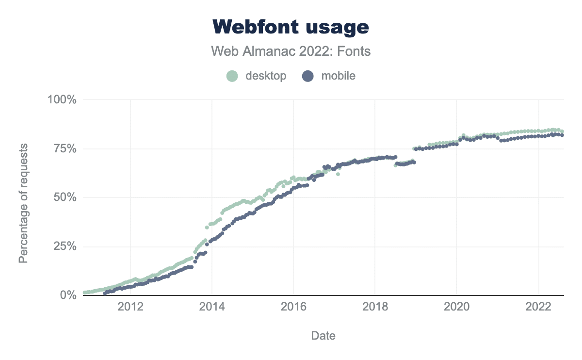
Fonts are a key element of a company’s visual communication strategy. While there is already a wide selection among the more than 1500 fonts hosted on Google Fonts, many brands turn to more premium catalogs, such as Adobe Fonts (formerly Typekit), or adopt fonts purchased directly from their designer. Even better, some design their own webfonts to align perfectly with their logo, like the host Kinsta, among others.
Combined with the near-infinite modifications made possible by CSS, webfonts can be used to create a visual environment consistent with the colors, images, and other design elements of a site. Drop shadows, reliefs, and even animations make them an extremely powerful and versatile design element. Unfortunately, these undeniable advantages come at a cost that every user pays when visiting your site.
What is the impact of fonts on Core Web Vitals?
Fonts affect two metrics. First, the LCP, when the main element is a text block whose display awaits the file. Then, the CLS, at the time of the switch between the fallback font and the final font. A single poorly declared font degrades both at the same time.
The impact of writing fonts on performance is very largely underestimated. Too many, poorly chosen, or unoptimized fonts can considerably penalize the User Experience and performance metrics, with Core Web Vitals at the forefront.
LCP very strongly impacted
The explanation comes from the resource prioritization mechanism built into browsers: to be able to display texts quickly, web fonts are called with very high priority. Their download thus consumes critical bandwidth and competes with other key resources such as stylesheets, images, or... other web fonts!
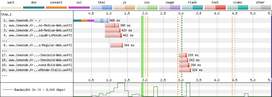
The Largest Contentful Paint (LCP) is consequently very sensitive to the volume of font files called. Several very common "errors" directly impact the LCP, either because the weight of the fonts increases, or because their download is subject to latency:
- Too high a number: we are not talking about the number of different web fonts but the number of font files needed to display a page. Each variation in weight (from 100 to 900) and each italic version that potentially goes with it constitutes a distinct file (with the exception of variable fonts). It is crucial to limit the number of files to 4 or 5 maximum, all fonts combined.
- Too high a weight: font files can include a variable number of characters, called "glyphs". However, it is common to see sites loading files that include subsets like "Greek", "Russian" or "Cyrillic" when they display texts in French or English.
- Unsuitable format: with Woff and Woff2 formats, it is possible to support more than 98% of browsers in use. These formats, designed specifically for web fonts, are thus sufficient on their own and effectively replace older and/or specific formats like eot (Internet Explorer), svg (Safari), and ttf. Too many sites continue to use these, with a major impact on the weight of downloaded resources.
- Remote hosting: using fonts hosted on Google Fonts or Typekit CDNs generates significant latency. To download these resources, the browser must connect to the remote server and perform DNS resolution, a connection, and then SSL negotiation. This adds between 500 ms and one second of extra delay.
- Request chains: to quickly download necessary font files, the browser must be able to detect them as quickly as possible during the initial page load. However, very often,
@font-facedeclarations are made within CSS files called from the pages, delaying their discovery by several hundred milliseconds.
High CLS risks
Beyond the issues inherent to the font files themselves, webfonts can cause significant Layout Shifts. The font-display: swap behavior, which allows users to start reading text before font files are downloaded, can indeed lead to variations in occupied space.
Generally minor on text paragraphs, horizontal or vertical shifts can be more significant on heading elements: when a word wraps to the next line on large text, this quickly represents several tens of pixels. The impact on User Experience is then problematic.
These movements are taken into account within the Core Web Vitals as " Cumulative Layout Shift ", or CLS.
Is your site as fast as your visitors expect?

Which font-display value to choose?
Stick with swap in almost all cases: the text displays immediately in a fallback font, then switches to the final font. optional is suitable for decorative fonts, where it's acceptable for them to never display. The auto, block, and fallback values are rarely suitable for a content site.
| Value | Behavior | Risk | When to use it |
|---|---|---|---|
auto | Let the browser decide | FOIT depending on the browser | Never knowingly |
block | Invisible text for up to 3s | Marked FOIT | Icon fonts only |
swap | Fallback displayed, then switch | FOUT and CLS risk | Body text, default case |
fallback | Very short switching window | Font sometimes ignored | Rare compromise |
optional | Font used only if ready | Font often not displayed | Decorative fonts |
Two acronyms structure this table. FOIT, for Flash of Invisible Text, refers to invisible text during loading; FOUT, for Flash of Unstyled Text, refers to the visible switch from one font to another. FOUT is always preferable to FOIT: readable text in the wrong font is better than a blank page, and its shift can be corrected with adjusted fallback metrics.
Each @font-face declaration can include a font-display descriptor, which tells the browser how to behave while downloading a webfont: hide the text, a phenomenon known as FOIT (Flash Of Invisible Text), or immediately display a fallback font, the famous FOUT (Flash Of Unstyled Text). This choice, documented in detail on MDN, directly influences the balance between text display speed and visual stability of the page.
Five values with very distinct behaviors
The descriptor accepts five values, which combine two periods differently: the block period, during which the text remains invisible, and the swap period, during which the fallback font can still be replaced by the webfont:
- auto: lets the browser decide. In almost all cases, this is equivalent to block.
- block: the text remains invisible for up to 3 seconds, then the fallback font is displayed while waiting for the webfont. This is the worst possible choice for LCP on a slow connection.
- swap: the fallback font is displayed from the first render, then the webfont replaces it as soon as it arrives. The text is immediately readable, at the risk of a Layout Shift during the switch.
- fallback: a compromise between the two, with a block period of about 100 ms and a swap period of about 3 seconds. If the webfont arrives too late, it is simply ignored for the current page.
- optional: after the same block period of about 100 ms, the webfont is only used if it is already available, typically in the cache. Otherwise, the fallback font is kept for the entire duration of the navigation.
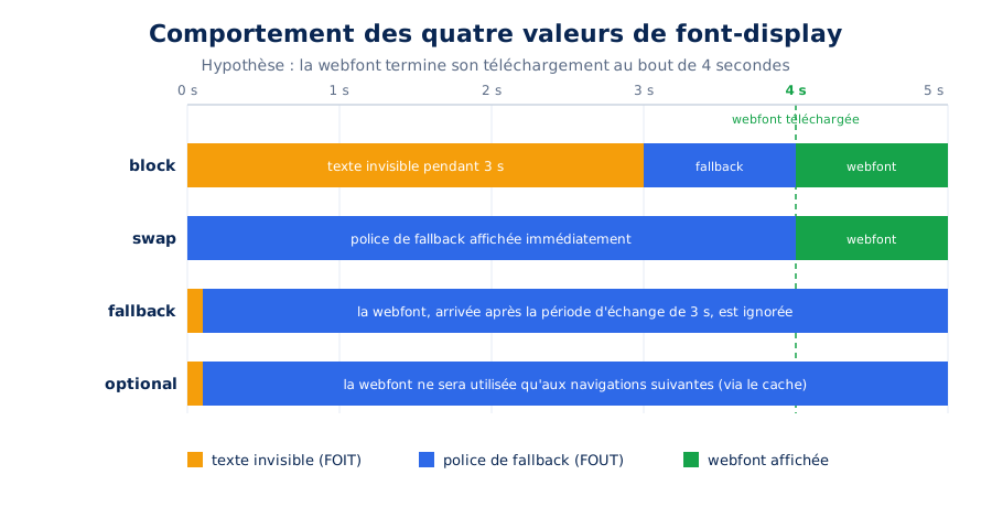
font-display values in the case of a webfont that takes 4 seconds to download.Our strategy according to font type
For text fonts, we systematically recommend font-display: swap, combined with an adjusted fallback font as described below: the content is readable from the first render, which preserves LCP, and the Layout Shift of the switch is neutralized. This is also the default behavior served by Google Fonts since 2019.
@font-face {
    font-family: "Inter";
    src: url("/fonts/inter-regular.woff2") format("woff2");
    font-weight: 400;
    font-style: normal;
    font-display: swap;
}
For icon fonts, however, swap is counterproductive: the fallback font does not contain the expected glyphs, and the user sees empty squares or inconsistent characters while loading. The block value is more relevant here, with the icon remaining invisible for a few moments before displaying correctly. It's worth remembering that these icon fonts are often very heavy for the few glyphs actually used, and a simple set of inline SVGs advantageously replaces them in most cases.
Finally, for a highly distinctive font loaded on a critical element, such as a hero title, the combination of font-display: optional and preloading is the safest option: web.dev presents it as the easiest way to eliminate all font-related Layout Shifts, with the webfont either displayed immediately or permanently replaced by its fallback.
How to optimize font loading?
Four techniques are combined: subsetting, which removes unused glyphs from the file; preloading the first screen fonts; a fallback stack with adjusted metrics to avoid shifting; and self-hosting in woff2. Subsetting commonly divides the weight by three on a full Latin font.
As is often the case when it comes to web performance, some optimization techniques are common sense: if writing fonts impact loading times, their use should be reduced. Similarly, if there are lightweight formats specifically adapted for the web, they should simply be used. And if their remote hosting generates latency, they should be hosted locally, quite simply (goodbye Google Fonts, then).
For many other issues, however, there are tools, sometimes quite technical, to reduce their impact. Here are the three we use daily.
Optimal subsetting of webfonts
Several tools can reduce the weight of font files that include unnecessary glyphs:
- Font Subsetter from everythingfonts.com: online and very easy to use, it is ideal for the least technical and most rushed profiles.
- Glyphhanger, based on fonttools, which offers many more possibilities but must be installed locally and configured via command line.
These different tools share a common point in their operation: you define what should be kept, not what should be deleted. To display texts in French or English, it will generally be enough to activate the two subsets "Basic Latin" and "Latin-1 Supplement".
This technique makes it possible to reduce the weight of font files by a factor of 2 to 7, depending on what was initially uploaded. The impact on LCP can thus be significant.
Unicode-range, on-demand subsetting
Subsetting becomes even more powerful when combined with the unicode-range descriptor. This allows you to tell the browser which character ranges are covered by each font file: the file is then downloaded only if the page actually displays at least one character from the relevant range, as explained by the MDN documentation.
This is exactly the mechanism that Google Fonts exploits by splitting each font into " latin ", " latin-ext ", " cyrillic ", or " greek " subsets. Here's what declarations of this type look like:
/* Caractères latins de base : téléchargé sur toutes les pages */
@font-face {
    font-family: "Manrope";
    src: url("/fonts/manrope-latin.woff2") format("woff2");
    font-display: swap;
    unicode-range: U+0000-00FF, U+0152-0153, U+2019, U+20AC;
}

/* Latin étendu : téléchargé uniquement si nécessaire */
@font-face {
    font-family: "Manrope";
    src: url("/fonts/manrope-latin-ext.woff2") format("woff2");
    font-display: swap;
    unicode-range: U+0100-024F, U+1E00-1EFF;
}
On a multilingual site, this approach avoids making French visitors pay for the weight of Polish or Czech glyphs, while ensuring correct display for each language. Be careful to split intelligently, however: each additional range corresponds to a potential request, and splitting too finely ends up multiplying the files to download instead of reducing their weight.
Defining optimized font stacks
To avoid behaviors like those illustrated above on the Courrier International website, it is essential to define fallback fonts that are as visually close as possible to the final webfonts within the font stack.
A visually similar safe font
The best practice is, initially, to choose the most relevant "safe font" from the nine available. These are fonts available in all browsers, regardless of the operating system:
- Arial
- Verdana
- Tahoma
- Trebuchet MS
- Times New Roman
- Georgia
- Courier New
- Brush Script MT
- Impact
An optimized direct fallback font
Despite selecting a visually similar system font, it is rare for the on-screen space occupied to be identical. The solution to completely eliminate any risk of Layout Shift when switching between them is to implement an optimized fallback font. This involves generating a virtual font from a safe font to make it even more visually similar.
The good news is that browsers now offer dedicated CSS descriptors for this adjustment, the functioning of which is described in detail in Katie Hempenius's article on font fallbacks. To generate your fallback font, you can use an online tool like Screenspan's Fallback Font Generator, which allows you to visually adjust the overlap of the two fonts.
In both cases, you will ultimately get CSS code that looks like this:
@font-face {
    font-family: "Montserrat-fallback";
    size-adjust: 113.38999999999997%;
    ascent-override: 83%;
    src: local("Arial");
}

body {
    font-family: Montserrat, "Montserrat-fallback", Arial, sans-serif;
}
This code relies on a family of relatively recent CSS descriptors supported by all modern browsers: size-adjust, which resizes the glyphs of the fallback font (MDN documentation), as well as ascent-override, descent-override, and line-gap-override, which align the vertical metrics (height above and below the baseline, line spacing) with those of the target webfont. When correctly calibrated, these four descriptors make the space occupied by the two fonts coincide to the pixel, and bring the CLS related to the switch to zero.
Preloading key font files
The third and final optimization we are sharing with you drastically reduces LCP on pages where it consists of text (title or paragraph), but also CLS for users with the fastest connections. It relies on the " Preload " Resource Hint, which forces the browser to download certain resources very early, even before they are discovered.
If you have read the above carefully, this is the most relevant solution for reducing latency related to request chains: instead of waiting for the browser to discover the font file it needs on its own, we serve it on a silver platter. Implementing preloads of this type is quite simple with locally hosted fonts. With GeneratePerf, our extension for GeneratePress, they are even generated automatically for the 97 self-hosted fonts it offers, including 90 variable fonts.
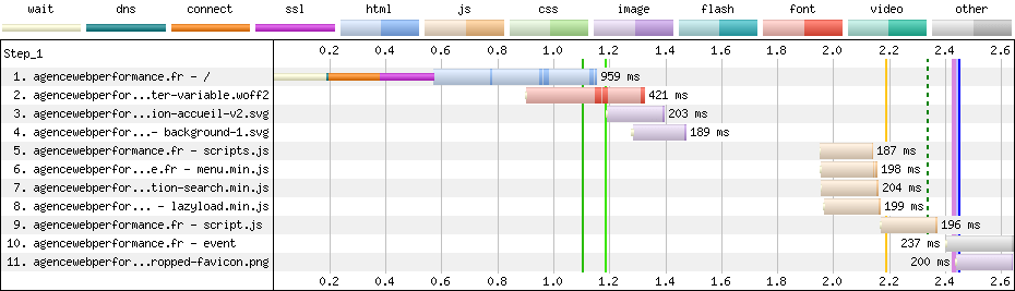
Be careful, however: we only preload one file per weight variation, and only in its lightest and most modern version, ideally Woff2. Here is an example of HTML code to integrate in the header:
<link rel="preload" as="font" type="font/woff2" href="https://agencewebperformance.fr/wp-content/plugins/generateperf/fonts/manrope-variable.woff2" crossorigin>What is a variable font and when to use it ?
A variable font groups all the weights and styles of a family into a single file, interpolated on demand. It advantageously replaces three or more files. Below two weights, it remains heavier than the corresponding static files.
Let's end this overview with the technology that has most profoundly changed how we integrate fonts: variable fonts. Where a classic family requires one file per weight and style, a variable font groups a complete continuum of variations in a single file, described along normalized axes: weight (wght), width (wdth), slant (slnt), italic (ital), and optical size (opsz), as detailed in the dedicated MDN guide.
Fewer requests, more typographic freedom
The performance benefit is immediate: instead of competing with four, six, or even eight high-priority files called during initial loading, you only download one or two (one for regular, one for italic). A variable file is admittedly heavier than an isolated static file, but significantly lighter than the sum of the files it replaces when three or more weights are used on the site.
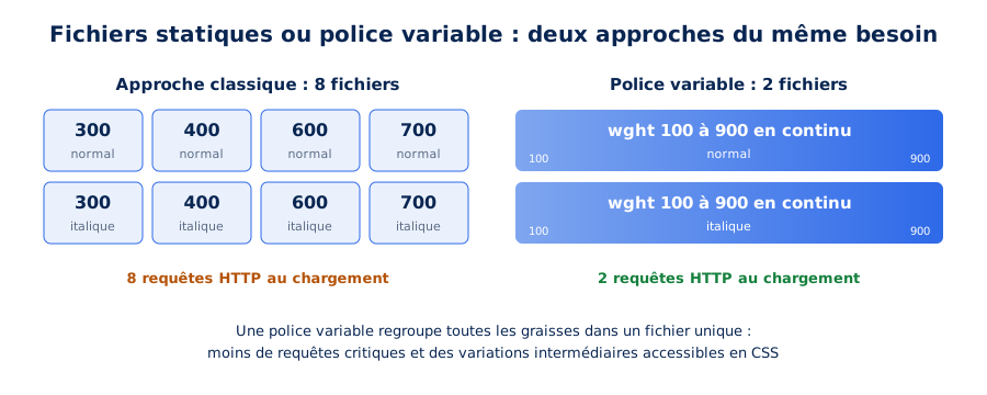
The benefit is also creative: all intermediate weights become accessible in CSS (font-weight: 550 for example), including in animations or on hover, without any additional requests. Browser support is now almost universal, making it a perfectly usable technology in production. It's also a choice we systematically make as part of our high-performance website creations.
A CSS declaration with value ranges
The @font-face declaration for a variable font differs little from that of a classic font: you simply specify value ranges rather than fixed values. The font-weight descriptor thus accepts two bounds, and the modern tech("variations") syntax allows you to signal to browsers that the file contains variations:
@font-face {
    font-family: "Inter";
    src: url("/fonts/inter-variable.woff2") format("woff2") tech("variations"),
         url("/fonts/inter-variable.woff2") format("woff2-variations");
    font-weight: 100 900;
    font-display: swap;
}
Once this declaration is in place, each font-weight used in the site's stylesheets draws from the same file, without additional requests or weights being approximated by the browser.
Generating an optimal variable file with fonttools
The variable files distributed by foundries often include much more than necessary: exotic axes, extreme weights, complete alphabets. To get the most out of them, we systematically rework them with fonttools, the reference Python toolkit for font manipulation, already mentioned earlier regarding subsetting.
The process involves instantiating a reduced version of the font, for example by keeping only weights from 300 to 800 on the wght axis, then generating a Woff2 file limited to the useful character ranges:
pip install fonttools brotli

fonttools varLib.instancer font.ttf wdth=100 wght=300:800

pyftsubset font-instance.ttf --flavor=woff2 --layout-features=kern,liga,clig --output-file="font.woff2" --unicodes="U+0020-007E,U+00A0-00FF,U+0152-0153,U+2019,U+20AC"
The resulting file combines all the optimizations described in this article: a modern format, subsetting adapted to the site's language, minimal weight, and total typographic flexibility. All that remains is to host it locally, preload it, and associate it with an adjusted fallback font to achieve text rendering that is both immediate and perfectly stable.
What to remember about web fonts
Fonts can significantly impact your website's performance, but it's possible to optimize them to minimize their impact. By following best practices and using the right tools, you can ensure your website is fast and responsive for all users, regardless of the fonts you choose.
As part of our performance optimization services, we implement these best practices in addition to dozens of others. If you need professional support to improve your site's performance, we invite you to contact us. And if you prefer to start by precisely identifying the weaknesses of your pages, our web performance audit is the ideal starting point.