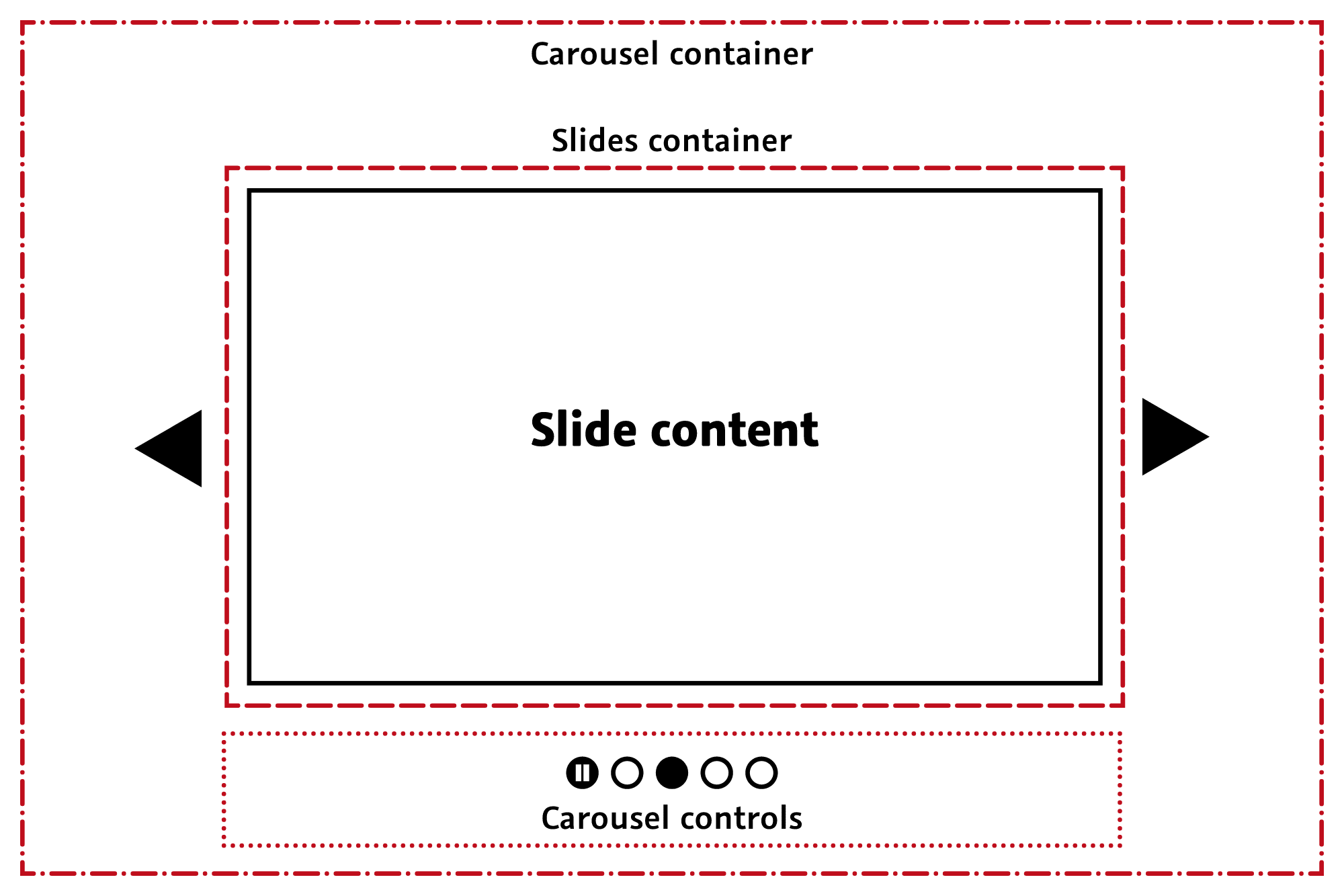
In the world of web design, sliders, also known as carousels and slideshows, have long been a popular element for presenting multiple contents in a reduced space. However, in-depth analysis, from both a web performance and user experience point of view, reveals significant drawbacks.
This article examines in detail why sliders should be avoided in modern web design, considering their impact on accessibility, user experience, web performance and eco-design.
By adopting a holistic perspective and drawing on data and recognized practices, we’ll demonstrate why it’s time to rethink the use of sliders in web design, for the benefit of users, businesses and the environment.
Sliders and accessibility: a difficult cohabitation
Digital accessibility is a fundamental element in web design, aimed at making digital content usable by all, including individuals with various types of disability, such as visual, auditory, motor and cognitive. The use of sliders (carousels) on websites poses major challenges in terms of accessibility, negatively impacting this inclusive approach.
Neurological disorders
Flashing or moving content, often characteristic of sliders, can induce seizures in photosensitive epileptics. Beyond this risk, these elements are generally considered annoying for the majority of users, which underlines how accessible web design and a good user experience are intrinsically linked.
Motor disabilities
Sliders can pose particular difficulties for people with physical disabilities who use adaptive technologies to navigate the web, such as voice commands or eye-tracking software. Such software generally has difficulty controlling the interactive elements of sliders, such as navigation or pause buttons.

Compliance with Web Accessibility standards
Sliders often pose problems of compliance with international web accessibility standards, such as the WCAG (Web Content Accessibility Guidelines) drawn up by the W3C (World Wide Web Consortium). The Web Accessibility Initiative has also devoted a tutorial to the subject, with concrete recommendations for facilitating access.
These guidelines are structured around four principles: perceivable, usable, understandable and robust. Sliders, by their very nature, can violate these principles by making content difficult to perceive, use or understand for users with specific needs.
Sliders and user experience: a counter-productive choice
The use of sliders or carousels on websites has a considerable impact on user experience (UX), a crucial aspect of a site’s success. Although the intention behind integrating sliders is often to energize the site and attract users’ attention, their real impact can be quite different, significantly influencing user engagement and satisfaction.
Low interaction and click-through rates
Sliders are often seen as an effective way of presenting multiple messages or products. However, studies show that users interact little with these elements.
In fact, the majority of clicks are concentrated on the first slide, with a significant drop-off for subsequent slides. This phenomenon is often attributed to “banner blindness”, where users instinctively ignore elements they associate with advertisements, as is often the case with sliders.
Legibility problems and cognitive overload
Sliders pose challenges in terms of legibility. Automatic scrolling, in particular, can disrupt the user’s ability to read and absorb information, creating a frustrating user experience. This frustration is exacerbated when the user attempts to read text on a slider that changes before he or she has finished.
What’s more, the presence of multiple messages in the same space can lead to cognitive overload, making it difficult for the user to concentrate on a specific piece of information or action. Last but not least, certain types of device (notably tablets) are not always well supported, leading to interfaces that are even less legible for some readers.

Impact on visual hierarchy and message clarity
Sliders can also blur the visual hierarchy of a page. In effective web design, it’s essential to guide users to important information or actions.
However, with multiple slides competing for attention, it becomes difficult for users to discern which is the main message or desired action. This confusion can diminish the effectiveness of communication and hinder the user’s ability to make informed decisions on the site.
Sliders and web performance: a major impact
The use of sliders or carousels on websites has a mechanical negative impact on web performance. While they may appear aesthetically pleasing, sliders lead to a number of technical problems that affect site speed and efficiency. Let’s take a closer look at how sliders affect web page performance.
Increased DOM volume
Sliders increase the volume of the site’s Document Object Model (DOM). Each element of a slider – images, text, buttons – adds additional nodes to the DOM. A large DOM slows down page rendering time, as the browser has to process a greater number of elements.
This is all the more problematic as, by definition, the majority of a slider’s “screens” are not immediately visible to the user. The increased processing cost is therefore, from a purely practical point of view, totally unnecessary during initial loading. The greater the number of elements in the slider, the worse the impact.
Increased number of resources downloaded
Slider JavaScript doesn’t always support image lazy-loading. Lazy-loading is a technique for delaying the loading of images until they are needed, i.e. when they enter the user’s viewport. The absence of effective lazy-loading means that all the images in the slider are downloaded as soon as the page is initially loaded, increasing page weight and loading time.
This mass downloading of additional resources, mainly images, places additional demands on bandwidth and can be particularly problematic for users with limited or slow Internet connections. The impact on performance metrics such as LCP and Speed Index is not negligible.

Increased consumption of CPU resources
The continuous animation of sliders, which is based on JavaScript code, leads to an increase in CPU resource consumption. This increased CPU consumption not only affects site performance, but also that of the user’s device.
Increased CPU usage due to sliders can have a negative impact on metrics such as Total Blocking Time (TBT) and Interaction to Next Paint (INP). TBT measures the amount of time the browser’s main thread is blocked long enough to prevent user input.
INP measures the delay between the user’s interaction with your page and the moment when the browser is able to respond to that interaction. Sliders, by placing excessive demands on the CPU, can increase these times, degrading the user experience.
Sliders and eco-design: unnecessary pollution
In the context of the eco-responsible web design we encourage, the evaluation of sliders must take into account their environmental impact. Aspects of web performance, as discussed above, have a direct impact not only on the user experience, but also on the resource consumption and ecological footprint of websites.
Increased consumption of CPU resources
The intensive use of CPU resources by sliders, due to continuous animations and the management of multiple DOM elements, results in higher energy consumption. This increased energy consumption is not only a burden on users’ devices, but also contributes to a larger carbon footprint.
In a context where reducing the carbon footprint is essential, this aspect of sliders is of particular concern.

Excessive use of bandwidth
As mentioned above, sliders often increase the number of resources downloaded, particularly images. This increase translates into higher bandwidth usage, which is particularly problematic for users with limited or expensive data connections.
Increased bandwidth usage means greater demand for data transmission, which in turn increases the energy consumption of data networks and data centers. This increase in energy consumption contributes to the overall carbon footprint associated with Internet browsing.
Sliders: alternatives for modern, efficient pages?
In the age of contemporary web design, the move towards a minimalist, focused approach is increasingly favored. This approach eliminates the complexity and distraction of sliders in favor of clear, direct communication. Adopting static, focused content fits perfectly into this approach, offering a controlled, intentional user experience.
Static, focused content
Instead of using sliders, consider featuring well-defined, static content. This choice focuses users’ attention on a single, relevant message, without the distractions associated with movement and multiple slides. A high-quality static image, combined with a punchy headline and clear call-to-action (CTA), can create a strong visual impact while guiding the user to a specific action.
Advantages of minimalism in web design
Minimalism in web design isn’t just about clean aesthetics, it’s also an effective strategy for improving web performance. Reducing the number of elements on a page reduces DOM load, optimizes loading times and improves accessibility. This simplicity also makes it easier for users to understand the message, encouraging more direct and intentional interaction.
So, what can we conclude?
Replacing sliders with static, focused content is not simply a design choice, it’s a strategic decision aligned with current trends in web efficiency, accessibility and sustainability.
This transition to thoughtful minimalism promotes a clearer, more direct user experience, while optimizing overall website performance. For web-focused companies and startups, adopting this approach represents an important step towards creating modern, efficient and responsible websites.
