
In the world of web design, sliders, also called carousels or rotating banners, have long been used to present multiple messages in a small space. They primarily solve a meeting problem: when three departments vie for the homepage, scrolling avoids having to make a choice. A serious analysis, from the perspective of accessibility, user experience, performance, and eco-design, reveals drawbacks that far outweigh their benefits.
A carousel is a component that displays a series of items one by one in the same frame, with navigation controls and, most often, automatic rotation. This simple definition hides three costly mechanisms: content that is loaded but invisible, movement that the visitor did not request, and JavaScript that runs continuously. Each of these mechanisms has a measurable effect on Core Web Vitals, and a documented effect on accessibility.
This article examines in detail why carousels should be avoided in modern site design, based on WCAG criteria, published interaction data, and Google's metrics documentation, and then what should be put in their place. How many of your visitors actually see the second slide, and what it costs them before it even displays?
Why does a carousel pose an accessibility problem?
Because it combines automatic movement, hidden content, and complex navigation, three points that WCAG explicitly governs. Criterion 2.2.2 requires a pause mechanism for any content that automatically moves for more than five seconds, and criterion 2.3.1 prohibits more than three flashes per second. A default carousel violates the first and flirts with the second.
Automatic movement, a Level A criterion
WCAG 2.2 criterion 2.2.2 Pause, Stop, Hide is precise: for any information that moves, blinks, or scrolls, that starts automatically, lasts more than five seconds, and is displayed in parallel with other content, the user must have a mechanism to pause, stop, or hide it. The documentation adds that an animation that only stops as long as focus remains on it does not count as a pause mechanism. A carousel that rotates every five seconds without a visible pause button fails a Level A criterion, the lowest of the three.
Movement is also a health issue. Flashing content can induce seizures in photosensitive epileptic individuals, which is limited by criterion 2.3.1: nothing should flash more than three times per second. Rapid transitions between contrasting slides approach this. And for people with vestibular disorders, MDN reminds us that the prefers-reduced-motion media query exists precisely to detect that a user has requested reduced non-essential animations. Most carousel libraries ignore this, and our guide on user preferences shows it costs two lines of CSS.
Keyboard, focus, and assistive technologies
People navigating by keyboard, voice command, or eye tracking encounter a second difficulty: carousel controls. The Web Accessibility Initiative tutorial requires that all functionality, including navigation between elements, be keyboard operable, and that focus position be managed reasonably and understandably.
In practice, focus often lands on a hidden slide, then on overlapping buttons, while content changes under the user's fingers. The same tutorial notes that carousels are controversial from a usability standpoint because their content is difficult to discover.
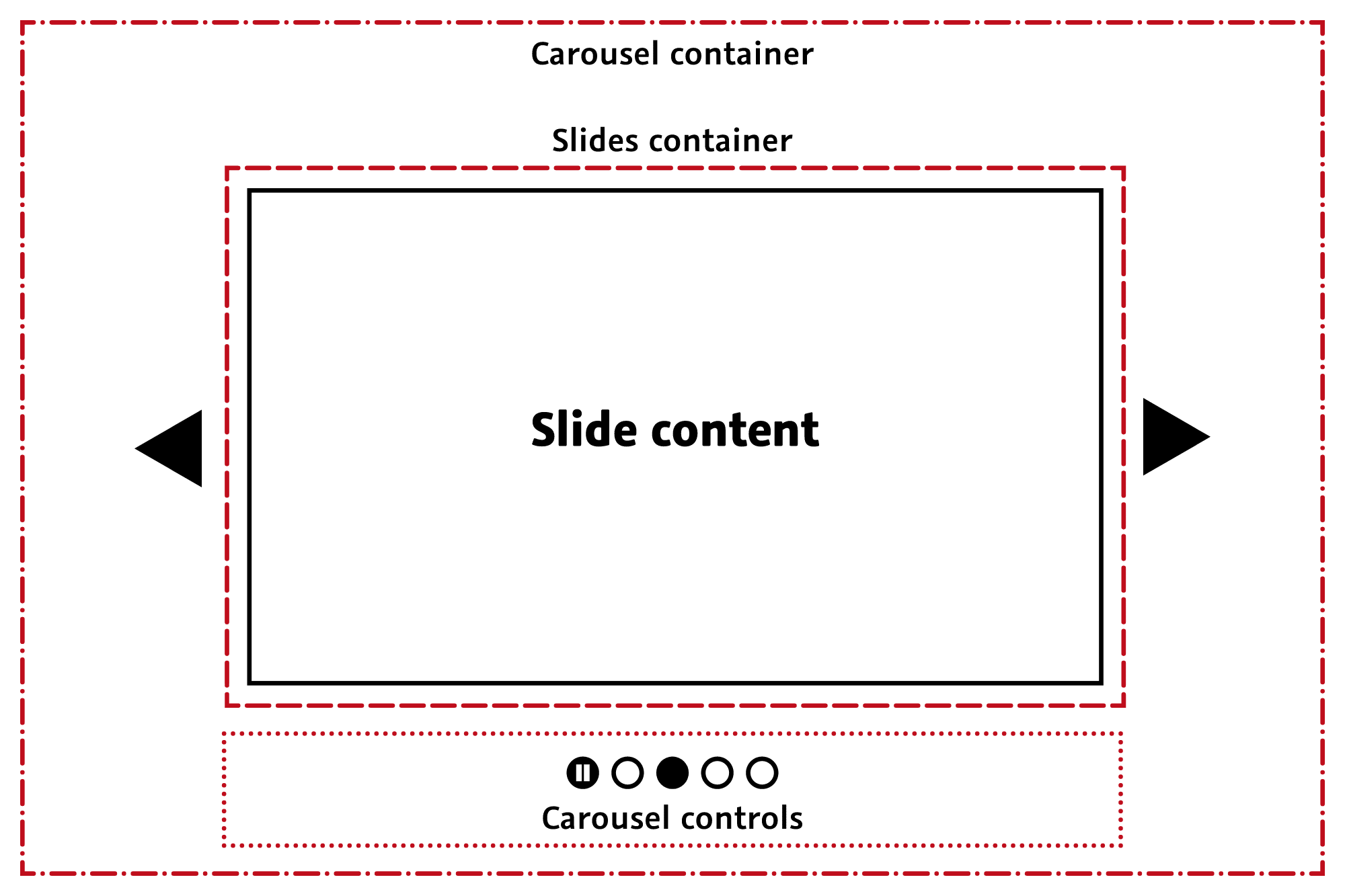
These requirements are no longer just recommendations. The French standard, detailed in our guide on RGAA and digital accessibility, incorporates WCAG level A and AA criteria, and the legal obligation was extended in June 2025 to a large portion of private services. A non-compliant carousel is therefore no longer an ergonomic detail, it is a point of non-compliance in a regulatory audit, and one of the easiest to remove.
Do visitors really click on a carousel?
Almost never. Erik Runyon's study on the University of Notre Dame website, published January 22, 2013, and still the reference on the subject, shows that about 1% of visitors click on a carousel element, and 84% of those clicks go to the first slide. The next four share 16% of one percent.
What the interaction numbers say
Runyon's statistics were collected from mid-October 2012 to January 22, 2013, across several university sites: 28,928 clicks on featured items, 315,665 manual slide changes, and a massive concentration on position 1, with others sharing about 4% each. A methodological precision that is often omitted: these figures concern a manually scrolled carousel. The only automatically rotating carousel in the study performed better, with 8.8% of visitors clicking, 40% of whom clicked on the first position, which remains a negligible return for the most visible element on the page.
The phenomenon has a name: banner blindness. Visitors instinctively ignore areas they associate with advertising, and a carousel is easily mistaken for one. Jakob Nielsen had already formulated this in the same week of January 2013, in an article from the Nielsen Norman Group that has not been contradicted since.
Accordions and carousels should only display a new panel when users request it.
Jakob Nielsen, co-founder of the Nielsen Norman Group, in his article Auto-Forwarding Carousels and Accordions Annoy Users and Reduce Visibility, published on January 19, 2013.
Readability and cognitive overload
Automatic scrolling disrupts the ability to read and absorb information: the text changes before the visitor has finished, and they can neither easily go back nor predict what's next. The presence of multiple messages in the same space also leads to cognitive overload, making it difficult to focus on one piece of information or action. On tablets and mobile devices, page scrolling and slide change gestures conflict, and some readers end up with an even less readable interface.
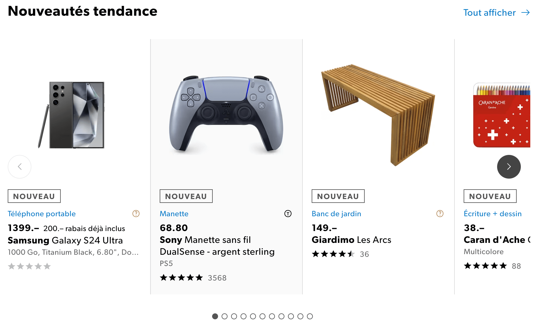
Finally, the carousel blurs the visual hierarchy. An effective page guides the user towards a primary piece of information or action; with five slides competing for attention, no one knows which is the important message anymore. This confusion reduces communication effectiveness, which is precisely the opposite of why the carousel was implemented. However, the most objective cost, the one that can be measured, is technical.
How does a carousel degrade Core Web Vitals?
On all three metrics at once. An auto-rotating carousel can move the LCP element with each slide change, produce what web.dev calls an infinite CLS, and continuously spin JavaScript within the INP measurement window. Google documents these three effects in its best practices for carousels, the first recommendation of which is three words long: don't use autoplay.
LCP, a moving target
Largest Contentful Paint tracks the largest element painted in the viewport, and stops considering new candidates as soon as the user interacts. Google's documentation draws a direct consequence from this: in an auto-rotating carousel, any slide can become the final LCP element, whereas in a static carousel only the first is a candidate.
Each rotation before the first interaction therefore potentially pushes back the LCP, and Google recommends, if autoplay is unavoidable, to give all slides the same intrinsic size. Our guide on LCP and how to optimize it explains why an image that arrives after the first render always costs more than an image present from the HTML.
CLS, potentially infinite
A layout shift is counted every time a visible element changes its position without user interaction in the preceding 500 ms. A slide that moves on its own is exactly that, and Google's documentation warns that on pages with automatic carousels, this can produce an infinite CLS, since the metric accumulates over the entire lifetime of the page.
Transitions that only use transform escape this counting, while those that modify left, margin, or the width of elements do not. Our article on CLS and how to optimize it details this distinction, which many older libraries do not respect.
The DOM, images, and JavaScript loading
Each slide adds its nodes to the DOM, its images to the download queue, and its event listeners to the main thread, whereas by definition a majority of these screens are not visible on load. Google identifies initiating the loading of carousel content via JavaScript as the biggest performance mistake, which delays images and degrades LCP.
Conversely, libraries that place all images in the HTML download them all with high priority, as in the official Swiper demos below. Both extremes are bad, and the right balance, first image with priority and subsequent ones deferred, is almost never the default.

INP and the cost of continuous movement
The continuous animations of a carousel rely on JavaScript that runs at fixed intervals, often several times per second for transitions. This work occupies the main thread, the one that needs to respond to clicks, and therefore falls within the Interaction to Next Paint measurement window every time a visitor interacts during a transition. Lighthouse's Total Blocking Time captures some of this during loading, while field INP captures it throughout the visit.
Our guide on INP and how to optimize it reminds us that the threshold is 200 ms for the worst interaction: a carousel animating while the visitor clicks elsewhere is enough to exceed it on an entry-level mobile.
Is your site as fast as your visitors expect?

Does a carousel have an environmental cost?
Yes, and it's documented. The repository of 115 web eco-design best practices from the GreenIT.fr collective dedicates its best practice #10 to limiting the use of carousels, for three cumulative reasons: images downloaded for nothing, continuously executed JavaScript, and energy consumed on millions of devices for slides that 1% of visitors watch.
In the context of the eco-responsible web design that we encourage, all of the above translates into consumption. The images of invisible slides use bandwidth, thus networks and data centers, which primarily impacts visitors with limited or expensive connections. The animations use the processor, thus the battery, on devices that their owners are keeping for longer and longer. The cost is paid on each visit, by each visitor, for a benefit that interaction figures do not confirm.
The good news is that eco-design and performance converge here without compromise. Removing a carousel reduces page weight, the number of requests, execution time, and the footprint, in a single decision. Our guide on image optimization shows that the same logic applies to every visual: the lightest image is the one that is not loaded, and a carousel loads four for nothing.
What are the alternatives to a carousel on a website?
A carousel is replaced by what it was trying to solve. If it was used to differentiate between several services on the homepage, the answer is editorial: decide rather than scroll. If it was used to present a catalog, a grid is more suitable. If it was used for animation, a quality image and careful typography produce the same effect. Three formats cover almost all cases:
- a single static visual, with a title and a call to action, which focuses attention on the main message and becomes an LCP element present from the HTML;
- a grid of several elements all visible simultaneously, which meets the need to show multiple offers without hiding four out of five behind a timer;
- a horizontal scrolling section controlled by the visitor, in pure CSS, which retains the idea of a series in a small space but leaves the initiative to the person.
None of these three formats move content automatically, which solves accessibility, CLS, and INP all at once. The grid deserves special mention because it meets the reason that justifies most carousels, showing multiple products or services in the same space, and because it displays them all at the same time instead of relying on a rotation that no one expects.
Controlled horizontal scrolling is the intermediate compromise, and Google notes that the Scroll Snap API allows carousel-type transitions to be implemented with only HTML and CSS. The result is accessible by keyboard by construction, respects motion preferences, only loads what is visible if images use loading="lazy", and doesn’t cost a line of JavaScript:
<ul class="galerie">
  <li><img src="produit-1.jpg" width="600" height="400" alt="Description du produit 1"></li>
  <li><img src="produit-2.jpg" width="600" height="400" alt="Description du produit 2" loading="lazy"></li>
  <li><img src="produit-3.jpg" width="600" height="400" alt="Description du produit 3" loading="lazy"></li>
</ul>

<style>
  .galerie {
    display: flex; gap: 1rem; padding: 0; list-style: none;
    overflow-x: auto;                  /* le visiteur fait defiler, rien ne bouge seul */
    scroll-snap-type: x mandatory;     /* chaque element s'aligne proprement */
    overscroll-behavior-x: contain;
  }
  .galerie li { flex: 0 0 80%; scroll-snap-align: start; }
  .galerie img { width: 100%; height: auto; display: block; }

  @media (prefers-reduced-motion: no-preference) {
    .galerie { scroll-behavior: smooth; } /* l'animation, seulement pour qui l'accepte */
  }
</style>
How to limit the damage of an imposed carousel?
By removing automatic rotation, by loading only the first image with priority, by reserving the dimensions of the container, and by making controls accessible by keyboard. Google recommends, if autoplay is absolutely imposed, to interrupt it on hover; WCAG requires a pause button. A controlled carousel costs much less than a default carousel, and these settings take only a few lines.
The case exists, when the direction or the brand guidelines impose it, and it is better to deal with it than to suffer it. The first step is to disable autoplay, or at least to condition it to prefers-reduced-motion and to stop it on hover and focus. The second is to give the first image a fetchpriority="high" and the following ones a loading="lazy", so that the LCP element is discovered from the HTML and the rest waits.
The third is to set width and height on each image and a height on the container, so that nothing shifts when the slides arrive:
<!-- Premiere diapositive : c'est l'element LCP, il doit etre decouvert dans le HTML -->
<img src="hero-1.jpg" width="1200" height="600" alt="..." fetchpriority="high">

<!-- Diapositives suivantes : differees tant qu'elles ne sont pas visibles -->
<img src="hero-2.jpg" width="1200" height="600" alt="..." loading="lazy">
<img src="hero-3.jpg" width="1200" height="600" alt="..." loading="lazy">

<script>
  // Autoplay seulement si le visiteur n'a pas demande a reduire le mouvement,
  // et jamais pendant qu'il survole ou a le focus dans le carrousel
  var reduit = matchMedia('(prefers-reduced-motion: reduce)').matches;
  if (!reduit) {
    var el = document.querySelector('.carrousel');
    var timer = setInterval(suivant, 7000);           // jamais moins de 5 s (WCAG 2.2.2)
    ['pointerenter', 'focusin'].forEach(function (ev) {
      el.addEventListener(ev, function () { clearInterval(timer); });
    });
    document.querySelector('.carrousel-pause').addEventListener('click', function () {
      clearInterval(timer);                            // le mecanisme de pause exige par les WCAG
    });
  }
</script>
These settings don't make the carousel useful, they make it harmless. Interaction numbers remain those of Runyon, and the next four slides will remain invisible to the vast majority of visitors. But the page stops paying for them, and the accessibility audit stops flagging them. This is the defensible minimum, not the goal.
What remains to be decided?
Replacing a carousel with static, focused content is not just a design choice, it's an editorial trade-off that the carousel allowed us to avoid. It forces us to answer the question that automatic rotation left open: what is the main message of this page, and what action should it lead to? A high-quality image, a clear headline, and a clear call to action answer this better than five slides that follow one another in front of visitors who aren't looking at them.
Minimalism in web design is not just a clean aesthetic, it's a performance strategy: fewer elements mean a lighter DOM, shorter loading times, simpler accessibility to maintain, and a better understood message.
The carousel is often the first element we recommend removing during a web performance audit, because it alone accumulates the three metrics and three families of criteria. What happens next, in a performance optimization, is to replace a layout reflex with a decision, and it's rarely the technical part that takes the most time.