
On almost all the sites we audit, images constitute the largest downloaded weight, far ahead of JavaScript and stylesheets. The Web Almanac from HTTP Archive, which analyzes millions of real pages each year, confirms this observation on a global scale: images remain the heaviest resource on a median page. And it's not just a matter of weight: in most cases, the largest element displayed on the screen, the one measured by LCP, is precisely an image.
The good news is that image optimization is one of the most profitable areas of web performance: the gains are massive, measurable, and the techniques are now standardized in browsers, without relying on third-party libraries. The less good news is that each lever has its pitfalls, and poorly applied optimization can degrade what it claims to improve. A classic example: lazy loading applied to the wrong image can cost several hundred milliseconds of LCP.
In this article, we review the entire pipeline: format selection, responsive sizing, loading prioritization, lazy loading, layout stability, the special case of SVGs, hosting, and automation. As with web fonts, the goal is to give you a complete and prioritized view of optimization levers, the kind we apply in our web performance audits.
Why do images weigh so heavily on performance?
Images represent the largest weight on a web page, far ahead of JavaScript and stylesheets. They impact all three Core Web Vitals simultaneously: LCP, because the main element is almost always an image; CLS, when their dimensions are not reserved; and INP, when their decoding occupies the main thread.
Before detailing the techniques, let's precisely position the impact. Images affect, directly or indirectly, the three Core Web Vitals metrics that Google uses to evaluate the loading experience, and which our article what is web performance and how is it measured lays the foundation for.
LCP: when the image dictates perceived speed
LCP (Largest Contentful Paint) measures the time it takes for the largest visible element to render within the initial viewport, with a threshold of 2.5 seconds to meet according to web.dev. Now, in the majority of cases measured across the web, this largest element is an image: a homepage banner, a product photo, an article visual.
Every link in the chain matters then: the discovery of the image in the HTML, its network priority, its weight, and then its decoding. An LCP image that is too heavy, discovered late, or loaded with low priority can, on its own, push the page over the 2.5-second threshold. The format, size, and prioritization levers detailed below each address a specific link in this chain.
CLS: When the Image Jumps the Layout
CLS (Cumulative Layout Shift) quantifies unexpected layout shifts during loading, with a threshold of 0.1 defined by web.dev. An image delivered without known dimensions forces the browser to reorganize the page upon its arrival: the paragraph the visitor was starting to read moves down a screen, the finger taps next to the intended button. Across the web, images without dimensions are the primary cause of CLS, and it is a completely avoidable problem, as we will see with explicit dimension attributes.
INP: When Decoding Blocks Interactivity
INP (Interaction to Next Paint) assesses the page's responsiveness to clicks, typing, and taps, with a threshold of 200 milliseconds documented on web.dev. The link with images is more indirect, but very real: decoding an image of several megapixels consumes processor time, and on an entry-level mobile, this decoding can delay the response to an interaction if it occurs at the wrong moment. Properly sized and deferred images free up the main execution thread when it is most needed.
Beyond the Core Web Vitals
There is also a pure bandwidth issue. An e-commerce product page commonly embeds 1.5 to 3 MB of images. On an average mobile connection, this is several seconds of download, data billed to the user, and energy consumed unnecessarily when three-quarters of these images will never be seen. Image optimization is thus the rare convergence point between performance, SEO, user experience, and efficiency.
The rest of this article follows the logical order of well-executed optimization: first reduce what is transferred (format, size), then order what is loaded (prioritization, lazy loading), finally stabilize what is displayed (dimensions, layout).
Which image format to choose between AVIF, WebP, and JPEG?
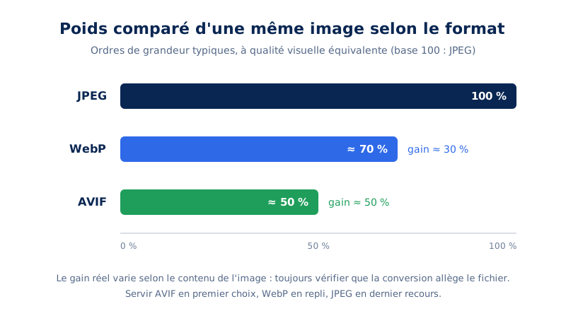
Serve AVIF first, with WebP as a fallback and JPEG as a last resort. At equivalent visual quality, AVIF produces the lightest files, WebP is in between, and JPEG remains the universal safety net. The picture tag allows serving all three without breaking any browser.
| Format | Relative weight | Compatibility | Use case |
|---|---|---|---|
| AVIF | Lightest | 94.7% of browsers | Photos, rich visuals, LCP image |
| WebP | Intermediate | 96.2% of browsers | Universal photo fallback |
| JPEG | Heaviest | Universal | Last resort, maximum compatibility |
| PNG | Heavy | Universal | Transparency without modern alternative |
| SVG | Variable, often minimal | Universal | Logos, icons, vector diagrams |
Compatibility rates are from Caniuse and are based on actual usage shares recorded in July 2026. The gap between AVIF and WebP is mainly due to Opera Mini and a few marginal browsers: for the French traffic of a mainstream site, both formats are served to almost all visitors.
The format affects the transferred weight, the CPU decoding cost, and the perceived quality. For raster images (photos, complex visuals), three formats currently share most of the relevant uses.
AVIF, the best quality-weight ratio
Derived from the AV1 video codec, AVIF offers the best current compromise: at equivalent visual quality, we commonly observe a gain of around 50% compared to JPEG and 20% compared to WebP. Its support is now universal on modern browsers, as confirmed by caniuse.com: Chrome since version 85, Firefox since 93, Safari since 16.4. AVIF supports transparency and wide color gamuts (HDR), making it a replacement for PNG in most cases. Its only drawback is slightly more CPU-intensive decoding, which should be monitored on very long mobile galleries.
WebP, the modern fallback
WebP has been supported everywhere since 2020 (including Safari 14) and remains an excellent fallback format. However, beware of a common misconception: WebP is not systematically lighter than JPEG. On an already well-compressed image, or one with low visual complexity, the conversion can produce a heavier file. A serious conversion chain always compares the result to the original file and keeps the lighter of the two, as recommended by web.dev.
JPEG and PNG, still useful as a last resort
JPEG retains two roles: serving as a universal fallback solution in a <picture> element, and remaining the reference format for certain images where it matches WebP. PNG, on the other hand, is only justified for very specific cases of lossless transparency when compatibility with older environments is required. As for TIFF and BMP, they have no reason to appear in production.
In practice, the format cascade is declared with the <picture> element: the browser iterates through the sources in order and selects the first one whose MIME type it supports, as documented on MDN.
<picture>
  <source srcset="visuel.avif" type="image/avif">
  <source srcset="visuel.webp" type="image/webp">
  <img src="visuel.jpg" width="1200" height="800" alt="Description du visuel">
</picture>
The case of animated GIFs
Animated GIF is probably the most costly format still in circulation: a palette limited to 256 colors, no efficient inter-frame compression, and files that easily reach several megabytes for a few seconds of animation. Converting to a silent MP4 or WebM video, played in a loop, typically reduces the weight by more than 90% according to web.dev, for a strictly identical rendering on screen.
How to serve the right image size with srcset ?
The srcset attribute declares multiple versions of the same image with their width in pixels, and sizes indicates the space the image will occupy in the layout. The browser then chooses the most suitable file for the screen size and device density, without any JavaScript intervention.
Changing format saves 30 to 50%. Serving an image sized for the visitor's screen can save much more: sending a 1600-pixel wide image in a space displayed at 400 pixels on mobile means transferring up to 7 times too much data. This is the most powerful lever in the entire chain, and paradoxically one of the most neglected.
The standard mechanism relies on two complementary attributes of the <img> tag, described in detail in the responsive images guide on web.dev. The srcset attribute declares the available variants with their actual width in pixels. The sizes attribute tells the browser the intended display width according to the viewport. With these two pieces of information and the screen's pixel density, the browser alone chooses the most economical variant.
<img
  src="hero-1200.avif"
  srcset="hero-600.avif 600w,
          hero-1200.avif 1200w,
          hero-2000.avif 2000w"
  sizes="(min-width: 1024px) 50vw, 100vw"
  width="1200" height="800"
  alt="Description du visuel">
Two errors consistently appear in our audits. The first: a srcset with only one variant, which is the same as not having one. You need at least two to three variants per image, excluding logos and icons. The second: a srcset with width descriptors but no sizes attribute. In this case, the browser assumes the image occupies 100% of the viewport and often downloads a variant that is too large. You also need to remember to keep sizes values up to date: after a graphic redesign, a sizes that no longer reflects the actual layout will silently cause the wrong variants to be downloaded.
The <picture> element complements this setup when the selection depends on something other than width: the format cascade mentioned earlier, artistic direction (serving a different crop on mobile), or dark mode via a prefers-color-scheme media query. The width and height dimensions are then always set on the final <img> tag, never on the <source> elements.
How to prioritize the LCP image?
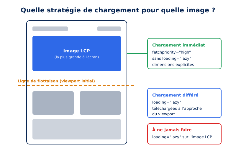
Add fetchpriority="high" to the page's main image and remove any loading="lazy" from it. Without this attribute, the browser downloads images with low priority by default and discovers the important one late. Only one image per page deserves this priority, the one that triggers the LCP.
Not all images on a page are equal. One deserves special treatment: the one that constitutes the LCP element, usually the large visual at the top of the page. However, by default, browsers load images with low priority until they have calculated the layout and understood which ones are visible. This delay of several hundred milliseconds directly impacts the LCP.
fetchpriority high on the LCP image
The fetchpriority="high" attribute corrects this behavior by promoting the image to a high network priority as soon as it's discovered in the HTML, as explained by web.dev. Measurements published by Addy Osmani (Chrome team) show LCP gains of 5% to 30% depending on the stacks, with an average around 15%. For an attribute that consists of one word, the effort-to-benefit ratio is unbeatable.
<img src="hero.avif"
     srcset="hero-800.avif 800w, hero-1600.avif 1600w"
     sizes="100vw"
     width="1600" height="900"
     fetchpriority="high"
     alt="Visuel principal de la page">
The golden rule: only one image per page should have fetchpriority="high". If five images claim it, the priority loses all meaning and the behavior reverts to the default. Footer images, on the other hand, can receive fetchpriority="low" to free up bandwidth for critical resources.
The CSS background image trap
A recurring trap deserves to be pointed out: when the main visual is served as a CSS background-image, it escapes the browser's preloader, which only discovers it after downloading and parsing the stylesheet. This is one of the most frequent causes of degraded LCP that we encounter. The clean solution is to convert the element into a real <img> or <picture> tag. Failing that, a <link rel="preload" as="image"> in the <head> allows triggering the download early, a technique detailed in web.dev's LCP optimization guide and in our article dedicated to LCP.
<link rel="preload" as="image"
      href="hero.avif"
      imagesrcset="hero-800.avif 800w, hero-1600.avif 1600w"
      imagesizes="100vw"
      fetchpriority="high">
Is your site as fast as your visitors expect?

How to defer loading images?
The loading="lazy" attribute is sufficient: it tells the browser to only download an image when it approaches the viewport, without any JavaScript library. It should never be applied to images visible on the first screen. Lazy loading applied to the LCP image degrades performance instead of improving it.
The exact counterpart to prioritization, lazy loading consists of not downloading images below the fold until the user gets close to them. Since 2020, this functionality is native in all browsers via the loading="lazy" attribute, documented on MDN: no JavaScript, no library, no observer to write.
<img src="illustration-section-basse.avif"
     loading="lazy"
     width="800" height="533"
     alt="Illustration de la section">

<iframe src="https://www.youtube.com/embed/xyz"
        loading="lazy"
        width="560" height="315"
        title="Titre de la vidéo"></iframe>
The browser triggers the download when the image approaches the viewport, with a lead time that depends on connection speed, as described by web.dev. The attribute also applies to iframes, which is valuable for embedded maps and video players. On this last point, we go further by recommending clickable facades, a topic related to third-party scripts.
Costly mistakes
The first, by far the most serious error: applying loading="lazy" to the LCP image. The browser then waits for confirmation that the image is visible before downloading it, which delays rendering by 200 to 800 milliseconds in the cases we measure. This error is all the more insidious because it is often produced by a plugin or theme that applies the attribute en masse. And the combination of loading="lazy" with fetchpriority="high" doesn't fix anything: lazy loading always wins.
Second error: JavaScript lazy loading systems based on data-src, inherited from before 2020. They break the browser's preloader and make images invisible if the script fails, offering no advantage over the native solution. Third error, more subtle: applying lazy loading to small, repeated images (avatars, icons), for which the mechanism's latency exceeds the benefit of deferring the download.
And async decoding?
We often come across the decoding="async" attribute presented as an essential optimization. The reality is more nuanced: modern browsers already decode most images off the main thread, and the MDN documentation describes an attribute with a limited scope. It's harmless and can be set by default, but its effect is only truly observable on very large images under heavy CPU pressure. In other words: worth adding, but certainly not a priority area for audits.
How to prevent images from causing the page to jump?
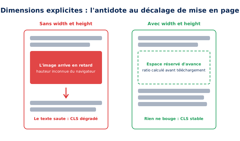
Systematically provide the width and height attributes on each img tag, with the intrinsic dimensions of the file. The browser then reserves the space even before the download. This is the most cost-effective fix against CLS, and it only costs two attributes per image.
An image without width and height attributes is an image whose proportions the browser ignores before downloading it. Consequence: it reserves zero height for it, displays the text, then redraws the entire layout when the image arrives. This visual jump is counted by CLS, and images without dimensions have historically been the primary cause of this on the web, as the CLS optimization guide from web.dev reminds us.
Since late 2019, all browsers calculate the aspect ratio from these two attributes and reserve the exact space even before the first byte of the image. The key point, often misunderstood: HTML values do not impose the display size. CSS remains in control, and the classic combination of max-width: 100% with height: auto maintains a perfectly responsive rendering while preserving the reserved ratio.
<img src="photo.avif" width="1600" height="900" alt="Description">

/* côté CSS : responsive sans casser le ratio réservé */
img {
  max-width: 100%;
  height: auto;
}
For CSS background images, which have no equivalent to these attributes, the aspect-ratio property allows reserving space directly in the stylesheet. And in a <picture> element, let's recall, dimensions are declared on the final <img> tag. It's a reflex to systematize: on most sites we optimize, simply generalizing explicit dimensions is enough to bring CLS below the 0.1 threshold targeted by Google. Our guide on Core Web Vitals in WordPress details this task on the CMS side.
When should you use the SVG format?
SVG is suitable for logos, icons, pictograms, and diagrams, i.e., any vector drawing that needs to remain sharp at all sizes. It is not suitable for photographs. Its weight depends on the complexity of the path, not the display dimensions, which makes it unbeatable for simple shapes.
For logos, icons, pictograms, and diagrams, the vector format SVG is unrivaled: it displays sharply at all resolutions, often weighs less than a kilobyte when optimized, and compresses remarkably well in Brotli or gzip since it's XML. A logo in PNG or, worse, JPEG, is an immediate red flag in an audit.
Three practices make a difference. First, systematically clean exported files from creation tools: metadata from Illustrator, Sketch, or Inkscape unnecessarily inflate the weight, and a pass through SVGO on the command line, or its web interface SVGOMG by Jake Archibald, removes them without affecting the rendering. Second, inline small critical SVGs like the header logo: this saves a network request. Finally, for icon sets, prefer a sprite declared once via <defs> and reused everywhere via <use>, rather than thirty identical SVGs repeated in the DOM.
Last point, often forgotten: an SVG without a viewBox or explicit dimensions causes the same layout shifts as a raster image without width or height. The stability rules seen above apply identically.
How to host and deliver your images efficiently?
Serve your images from a CDN, with a long browser cache and a versioned filename. The distance to the visitor and the cache policy weigh as much as the file size itself. A well-compressed but poorly served image remains slow, especially on repeat visits.
The best format in the world doesn't compensate for poor delivery. First principle: host images on your own domain. Each third-party domain imposes an additional DNS resolution and TLS negotiation, typically adding 100 to 300 milliseconds of overhead on mobile. Since Chrome partitioned its HTTP cache, the argument for a shared cache between sites has completely disappeared: a third-party resource is re-downloaded for every site that uses it.
If an image CDN is justified (on-the-fly resizing, automatic format conversion based on the browser), the best practice is to serve it behind a CNAME alias of the main domain rather than from the provider's domain. We have dedicated a full article to the pros and cons of CDNs to help you decide. Second principle: an aggressive browser cache policy. Images versioned in their filename can have a Cache-Control of one year with the immutable directive, which eliminates any revalidation for subsequent visits.
Finally, the quality of the origin infrastructure remains crucial: Brotli compression enabled, HTTP/2 or HTTP/3 to parallelize downloads, and controlled server response times. This is precisely what we guarantee with our WordPress hosting optimized for performance.
How to automate image optimization?
Optimization should happen when the file is uploaded, not manually. An automated pipeline generates modern formats, produces intermediate sizes, and applies compression, without contributor intervention. Any step left manual eventually gets forgotten, and the site degrades over time with new publications.
All of the above is only valuable if applied to 100% of images, including those that contributors will upload next year. Manual optimization doesn't scale: an automated pipeline is necessary.
On WordPress, some of the work is natively supported: the CMS automatically generates multiple sizes on upload and builds the corresponding srcset, applies loading="lazy" to images outside the initial viewport, and knows how to set fetchpriority="high" on the main image, a continuous effort by the core performance team documented on make.wordpress.org. Support for the AVIF format in the media library has been native since WordPress 6.5. Automatic conversion of uploads to AVIF can be controlled with a filter:
<?php
// Générer les tailles intermédiaires en AVIF à l'upload
add_filter( 'image_editor_output_format', function ( $formats ) {
    $formats['image/jpeg'] = 'image/avif';
    $formats['image/png']  = 'image/avif';
    return $formats;
} );
This native foundation has its limits, however: no comparison of weight before and after conversion, global quality settings, and no reuse of existing content without dedicated processing. This is where specialized plugins or a custom build chain come in, to be chosen according to the context. This fine-tuning, which also includes excluding the LCP image from lazy loading, is part of the standard interventions in our WordPress optimization service. Outside of CMS, on modern JavaScript stacks, frameworks provide image components that industrialize these same principles; our SPA audits verify that they are correctly configured.
How to optimize images on WordPress?
WordPress already does part of the work without configuration: it generates intermediate sizes with each upload, automatically populates srcset and sizes in the content, and applies loading="lazy" to images outside the initial viewport. Three important levers remain your responsibility, and these are precisely the ones that have the most impact.
The first is the format. The core of WordPress does not convert uploads to AVIF or WebP: without a dedicated extension or processing at upload, your visitors receive the original JPEG. This is the most significant weight saving left aside on the majority of installations we audit.
The second is the prioritization of the LCP image. WordPress applies a heuristic to remove lazy loading from the first few images, but it does not reliably set fetchpriority="high" on all templates, especially with a page builder. Check the attribute on the final render, not in the editor.
The third is the proliferation of intermediate sizes. Each theme and each plugin declares its own: a loaded installation commonly produces fifteen variations per uploaded image, half of which will never be served. The disk and backups pay the price, without any benefit to the visitor.
How to measure the effect of image optimization?
Note three indicators before and after: the total weight of the page's images, the field LCP at the 75th percentile, and the format actually served to your visitors. The first two indicate whether the gain exists, the third indicates whether your chain is working. Unmeasured optimization is just a hypothesis.
As always in performance, we only steer what we measure. Synthetic audit tools identify most of the issues mentioned here: Lighthouse and PageSpeed Insights flag oversized images, obsolete formats, images without dimensions, and candidates for lazy loading, with an estimate of the byte savings for each. We compared these two tools in a dedicated article.
The DevTools network panel complements the analysis: filter by images, sort by weight, and check the effective request priority for the LCP image. However, be careful not to conclude based solely on lab tests: only field data, from the CrUX report or a RUM tool, reflects what your visitors actually experience, on their devices and connections. This is the entire purpose of our web performance monitoring service: to track these metrics continuously and detect regressions before they cost positions or conversions.
What to remember about image optimization
If you were to remember only one method, it would be this one, in order. Serve modern formats, AVIF as the first choice with WebP as a fallback then JPEG, verifying that each conversion actually lightens the file. Provide each image in multiple sizes with srcset and sizes. Give network priority to the LCP image with fetchpriority="high", and to it alone. Defer all images below the fold with loading="lazy", being careful never to apply it to the LCP image. Declare width and height on each image for stable CLS. Process SVGs with SVGO, host your images on your domain with a long cache policy, and automate everything so that the discipline survives future uploads.
Each site nevertheless has its specificities: theme, plugins, CDN, editorial habits. To know precisely where your room for improvement lies and to quantify it, a web performance audit provides a prioritized and quantified action plan; and if you prefer to delegate the entire project, our team will handle it from start to finish as part of an optimization service.