
"Eliminate render-blocking resources": the warning is among the oldest in PageSpeed Insights, and among the most poorly handled. Cache extensions promise to fix it with one click, by generating "critical CSS" or removing "unused CSS". The warning often disappears; the page itself doesn't always display better, and sometimes it starts jumping around when the rest of the CSS arrives.
The subject deserves more than a checkbox. CSS blocks rendering for a specific reason, critical CSS meets a measurable network constraint, and a generator can produce critical CSS that contains all the right rules while painting a different page than the full stylesheet. This guide addresses the issue in order: why CSS blocks rendering, when critical CSS is justified, how to generate it, and above all, how to control it.
It draws on three recent interventions by the agency, presented with their measurement conditions: a stylesheet so small that putting it online yielded nothing, stylesheets applied one by one that increased CLS, and a generator whose three flaws only appeared at certain widths. One question to start: does your critical CSS paint the same page as your full stylesheet?
Why does CSS block a page from rendering?
Because the browser refuses to paint a page without its styles. As long as a stylesheet applicable to the screen has not been downloaded and parsed, Chrome, Firefox, and Safari paint nothing, to avoid a raw display followed by a jump. Each <link rel="stylesheet"> stylesheet in the <head> therefore delays the first render, and thus the FCP and often the LCP.
What blocks rendering
A stylesheet linked by <link rel="stylesheet"> whose media attribute matches the screen blocks the first render; this is the default case, without a media attribute. An @import rule in a stylesheet also blocks, with an additional drawback: the browser only discovers the imported stylesheet after receiving and parsing the parent stylesheet, hence an additional network round trip on the critical path, as Harry Roberts explains in his 2018 article on CSS and network performance.
CSS also affects scripts. A synchronous script placed after a stylesheet waits for that stylesheet to load before executing, as it can read computed styles : the stylesheet then delays everything that follows the script in the document. Finally, the blocking="render" attribute, documented by MDN on <link>, <style>, and <script>, makes a resource render-blocking that is not by default, which is rarely useful outside of very specific cases.
What doesn't block
A stylesheet whose media query does not match the screen (media="print", media="(min-width: 1600px)" on a narrower screen) is downloaded without blocking rendering. This is the behavior exploited by the deferred loading technique described later. The trade-off is a very low download priority : an off-screen stylesheet does not take precedence over useful resources, which is intended as long as it only serves content located further down.
Reading it in the browser and in Lighthouse
Chromium exposes the status of each resource in the Resource Timing API : PerformanceResourceTiming.renderBlockingStatus is either blocking or non-blocking. MDN classifies the property as having limited availability, absent from Firefox and Safari at the time of writing, but it is sufficient for diagnosis from Chrome. The console snippets in the last section use it.
On the Lighthouse side, version 13, released on October 10, 2025, replaced the historical render-blocking-resources audit with the render-blocking-insight insight, the same as in Chrome's Performance panel. Its documentation advises deferring what is not necessary for the initial display and hosting small critical resources online, warning that critical CSS is an advanced technique, capable of improving performance as well as introducing bugs. The rest of this article shows which ones.
What is critical CSS?
Critical CSS is the subset of rules necessary for the initial viewport, hosted inline in a <style> tag within the <head>. The browser then paints the top of the page as soon as it receives the HTML, without waiting for any external stylesheets; the complete stylesheet is then loaded without blocking. web.dev describes it in its article on extracting critical CSS.
The 14 KB budget
Critical CSS is subject to a network constraint. On a new TCP connection, the server cannot send the entire document at once: it starts with an initial congestion window, then waits for acknowledgments before sending more. RFC 6928, published in April 2013, sets this window to min(10 × MSS, max(2 × MSS, 14,600)) bytes, which is ten segments and at most 14,600 bytes on the first round trip with the current Ethernet segment size.
These 14 KB are counted in transmitted bytes, so after gzip or Brotli compression, and they include everything sent on the first round trip: the top of the HTML, inline CSS, and response headers.
The budget remains an order of magnitude: TLS adds its own exchanges before the first byte of HTML, HTTP/3 over QUIC applies a similar startup rule, and a server can be configured with a different initial window. The order of magnitude, however, remains correct: what fits in 14 KB transmitted arrives in one round trip, each subsequent slice costs at least one.
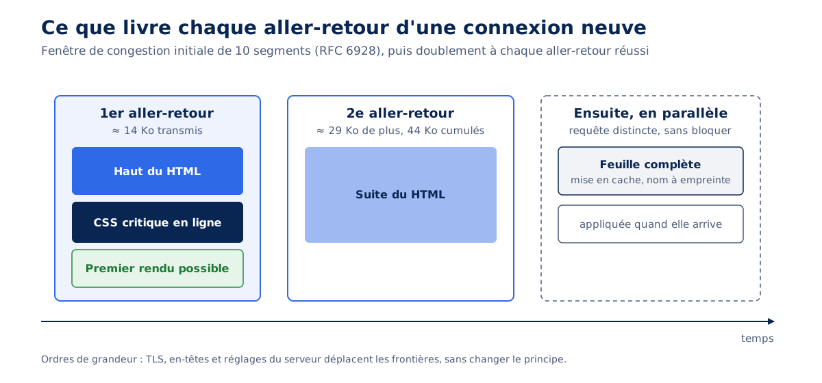
The window then doubles with each successful round trip: about 14 KB, then 29 KB, totaling 44 KB by the end of the second round trip. On a mobile network where one round trip costs 100 to 150 ms, the difference between a first screen delivered in one round trip and a first screen that requires three is measured in hundreds of milliseconds of FCP. Our article on HTTP/2, HTTP/3, and QUIC details what each protocol version changes regarding these round trips.
The downside: CSS without a cache
Inline CSS travels with each HTML page. It is never cached separately, so it is re-downloaded with each navigation, whereas an external stylesheet served with a long-lived Cache-Control header costs nothing from the second page onwards. 6 KB of transmitted critical CSS costs 6 KB per page view, which remains reasonable; 60 KB of "critical" CSS, often the entire stylesheet copied over, negates the benefit and reproduces the blocking cost without the cache advantage, as explained in our web cache guide.
Should you always generate critical CSS?
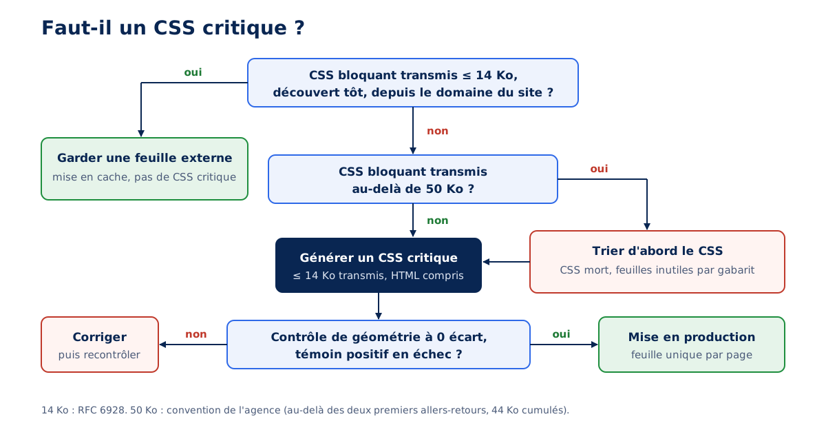
Critical CSS becomes useful when blocking CSS exceeds the first round trip, about 14 KB transmitted. Below that, a single, compact stylesheet served early from the site's domain arrives with the HTML; beyond 50 KB transmitted, it becomes indispensable, according to the agency's convention outlined below.
Checkpoints, and a convention
The table below summarizes the thresholds that the agency applies in audits. The 14 KB budget stems from RFC 6928; the 50 KB and 10 KB thresholds are agency conventions. The first corresponds to the point where blocking CSS alone exceeds the first two round trips of a new connection (44 KB cumulative): it indicates that no sorting has been done. The second corresponds to about two-thirds of the first round trip, a size from which a late-discovered stylesheet impacts the initial render.
| Situation | Expected | To improve | Critical |
|---|---|---|---|
Critical CSS inline in the <head> | 14 KB transferred max, including page header HTML | Over 14 KB transferred | Several tens of KB, full stylesheet copied |
| Blocking stylesheets, total transferred | 14 KB max, or none | Over 14 KB | Over 50 KB (agency convention) |
| Blocking stylesheets with no inline CSS | Acceptable if they fit together within 14 KB, from the site's domain | Fits within 14 KB but discovered late | Over 14 KB |
<style> in the <body> for the initial screen | None | Each occurrence | Not applicable |
| Blocking stylesheet over 10 KB discovered late | Announced by preload as="style" | Not announced (agency convention: 10 KB) | Not applicable |
@import rule | None | Not applicable | Each occurrence |
The case where critical CSS is useless
On October 8, 2026, the agency put all CSS inline on one of its own web applications. The single blocking stylesheet weighed 44.5 KB decoded and 8.6 KB transferred in Brotli, served from the same domain over HTTP/2 behind Cloudflare: it therefore already fit within the first round trip. PageSpeed Insights and GTmetrix nevertheless estimated the gain of inlining at 110 to 133 ms, and the blocking resource alert remained displayed.
Result: GTmetrix in mobile profile (Paris server, 4G at 9 Mb/s down and 125 ms latency) measured an LCP of 1,050 ms on one run, versus 1,122 and 1,050 ms with the external stylesheet on two runs; Lighthouse locally gave a mobile LCP of 1.5 to 1.7 s, versus 1.5 to 1.6 s.
No measurable gain, therefore, and two losses: a stylesheet that was no longer cached from one page to another, and a W3C validator that reported 22 messages about recent inline CSS properties. The external stylesheet was restored.
The lesson can be summed up in one sentence: the gain estimated by a lab tool counts the stylesheet as one more request, without knowing that it arrives in the same round trip as the HTML. The transferred budget decides, the alert informs. The order in which to tackle performance tasks, including CSS, is discussed in our article on web performance priorities.
How to load the rest of the CSS without blocking?
Two patterns are relevant: the stylesheet declared with media="print" then switched on load, or the stylesheet preloaded with rel="preload" as="style" then converted into a stylesheet. Both require a <noscript> fallback for browsers without JavaScript, and a switching script compatible with the site's security policy.
The media="print" pattern, switched by an external script
The principle: declare the complete stylesheet with a media that does not match the screen, which downloads it without blocking, then restore its original media once loaded. The most common version writes the switch in an onload="this.media='all'" attribute. However, an inline event handler is subject to the script-src-attr (or, failing that, script-src) directive of the Content Security Policy: under a strict CSP, it is blocked, and the stylesheet remains in print forever.
The same web.dev article on deferring non-critical CSS recommends, in production, an external loading function compatible with a CSP. The variant below carries the original media in a data-media attribute and entrusts the switch to a small external script; it was verified under script-src 'self' in Chromium 141, stylesheet applied and non-blocking status.
<head>
  <!-- 1. CSS critique : uniquement ce que peint le premier écran -->
  <style>/* … règles du haut de page … */</style>

  <!-- 2. Feuille complète téléchargée sans bloquer : media="print" ne correspond pas à l'écran -->
  <link rel="stylesheet" href="/css/site.3f9a1c.css" media="print" data-media="all">

  <!-- 3. Repli sans JavaScript : la feuille dans son media d'origine -->
  <noscript><link rel="stylesheet" href="/css/site.3f9a1c.css"></noscript>

  <!-- 4. Bascule par un script externe, autorisé par script-src 'self' -->
  <script src="/js/css-differe.js" defer></script>
</head>

// /js/css-differe.js : rend à chaque feuille différée son media d'origine une fois chargée
document.querySelectorAll('link[rel="stylesheet"][data-media]').forEach((lien) => {
  const appliquer = () => { lien.media = lien.dataset.media; };
  if (lien.sheet) appliquer(); // déjà chargée avant l'exécution du script
  else lien.addEventListener('load', appliquer, { once: true });
});
A stylesheet whose media does not match the screen starts with the lowest priority and is not detected by the preloading analysis; it is only downloaded once reached by the main parser. Measured by Agence Web Performance on October 2, 2026, in Chrome 154, on a WordPress benchmark with a 2s blocking script placed before it: stylesheet requested at 2.1s with minimal priority, versus 0.1s with maximum priority without rewriting. The technique is therefore reserved for the CSS of the rest of the page; that of the first screen belongs to critical CSS.
The stylesheet linked at the end of the <body>, a false good idea
Simply moving the <link> to the end of the <body> seems simpler. Chrome correctly classifies this stylesheet as non-blocking. But when the HTML arrives quickly and in its entirety before the first render, Chrome often waits for the stylesheet to paint: the parser has already reached it, and Jake Archibald described as early as 2016, in his post on <link> in the <body>, browsers suspending rendering upon discovering a stylesheet. The announced status and the observed behavior diverge.
Measurement by the Agence Web Performance on October 2, 2026 (Chromium 153, 1440 × 900 computer, network throttled to 40 ms and 10 Mb/s, 20 pages, 620 loads per version): the first render preceded the arrival of the stylesheet in only 224 out of 620 loads with uncompressed HTML, and 117 out of 620 once the HTML was compressed, thus arriving faster. The faster the HTML arrives, the more the "non-blocking" stylesheet blocks. The check to perform is the last part: compare the arrival time of the stylesheet and the FCP, rather than reading its status.
One stylesheet per page instead of a cascade in pieces
The second pitfall comes from splitting. A site that separately links the component library, the site stylesheet, and the page stylesheet, all loaded non-blockingly after critical CSS, does not transition directly to the final state: each arriving stylesheet restarts the cascade, and the page goes through as many intermediate states as there are stylesheets. A base library that resets margins can undo, for a few hundred milliseconds, what the critical CSS had fixed.
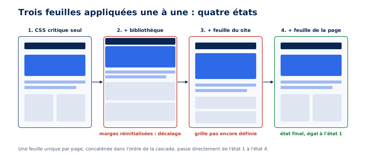
Measurement by the Agence Web Performance on October 2, 2026, on a client site with 31 pages (Chromium 153, 20 loads per page per profile): CLS from 0.19 to 1.05 on computer profile in PageSpeed Insights.
In the lab, we counted 422 loads out of 620 above the 0.1 threshold on computer, with two or three successive states of the main container on the most affected pages. After grouping into one stylesheet per page, there were 7 loads remaining above the threshold, all due to font changes, then zero after adjusting the fallback font; on mobile, from 138 to zero.
The bundled stylesheet is built at compile time : concatenated stylesheets in cascade order, minified, fingerprint filename (site.3f9a1c.css), precompressed version, and Cache-Control: max-age=315360000, public, immutable header since any change alters the name. The accepted cost is the library re-downloaded with each bundle ; fallback font calibration is detailed in our article on font impact, and CLS in general in our CLS guide.
Relative url()s in an inline CSS
Last, silent trap : a relative URL in a stylesheet resolves from the stylesheet’s URL, and that of an inline <style> tag from the page’s URL.
A rule url('../fonts/font.woff2'), just in the CSS file, points elsewhere once copied into the HTML : font or image returns a 404, with no other signal than a fallback font display. In any stylesheet likely to be put online, write paths from the site root (/wp-content/themes/…). WordPress rewrites paths for stylesheets it puts online itself ; the risk lies with manual copies and other tools.
Is your site as fast as your visitors expect?

What are critical CSS generators worth?
Generators find the right rules, but can render them in an order or form that changes the rendering. On a client site checked on October 2, 2026, module critical 9.0.0 produced 13 to 40 geometry discrepancies per width on the first two pages tested : each generation must be checked, regardless of the tool.
The critical module and its three flaws
The npm module critical, by Addy Osmani, is the reference for generators : it loads the page in Chromium at each requested width, keeps the rules for which an element touches the first screen, then assembles the result. On the checked site, at 1,440px, the main container measured 1,232px with only the critical CSS and 1,248px with the full stylesheet, and the home page title was 438px wide instead of 672px. Three distinct causes explained these discrepancies.
First flaw, the union of widths breaks the cascade. The version 9 rendering engine calculates the critical CSS for each width, from smallest to largest, then concatenates the results before deduplicating. The resulting sequence is no longer in the original stylesheet’s order : the base rule for one width comes back after the media query for a previous width, and overrides it at equal specificity.
/* Sortie de la largeur 1 280 px */
@media (min-width: 1280px) { .container { padding-inline: 2rem } }

/* Sortie de la largeur 1 440 px, ajoutée à la suite :
   la règle de base revient APRÈS la requête média et l'emporte à 1 280 px et au-delà */
.container { padding-inline: 1rem; max-width: 1248px; margin-inline: auto }

/* Ordre attendu, celui de la feuille d'origine :
   .container { padding-inline: 1rem; … }
   @media (min-width: 1280px) { .container { padding-inline: 2rem } } */
Reproduced by Agence Web Performance on October 15, 2026, on a minimal bench (Chromium 141) : with this critical CSS, the geometry control described below shows 4 deviations at 1,280 and 1,440 px, none at 375 px. The defect only appears at widths where the media query applies, which explains why a quick look on mobile doesn't reveal it.
Second defect, the rules that hide are forgotten. A rule is kept if an element it designates has a box that cuts the first screen. However, an element hidden by the complete stylesheet (display: none) has no box: the rule that hides it is never retained, and the critical CSS alone displays it. On the site checked, an empty error message below the search field, with 4 px of margin, shifted the entire bottom of the first screen.
Third defect, shortcuts to var() are lost. critical copies each rule by its serialization rule.style.cssText. When a shortcut contains var(), its detailed properties wait for the variable substitution and serialize into an empty string if a subsequent declaration in the same rule replaces one; the CSS variables specification anticipates this behavior, so any tool that serializes the CSSOM suffers from it.
/* Règle d'origine */
.carte { border: 1px solid var(--bord); border-left: 4px solid green }

/* Ce que rend rule.style.cssText (vérifié dans Chromium 141 le 15 octobre 2026) */
.carte { border-top-color: ; border-top-style: ; border-top-width: ; … border-left: 4px solid green; }

/* Recopiées dans un <style>, les déclarations vides sont invalides :
   la bordure disparaît du CSS critique, et chaque carte perd 2 px de hauteur */
The extraction tool written for the intervention corrects all three: merged in the original order of the rules, the root of a hidden element is retained when its parent touches the first screen, declarations are retrieved from the source text when serialization loses them. Result on this site, on October 2, 2026: 58 pages regenerated, zero deviations at the four widths, 57 critical CSS files under 7 KB compressed and one at 7.3 KB.
WordPress Plugins
On WordPress, generation most often goes through a cache or optimization plugin. Three approaches dominate, documented by their publishers. WP Rocket offers "Load CSS Asynchronously" (critical CSS and deferred sheets) and "Remove Unused CSS", which generates the used CSS for each URL via a remote service, inserts it into a <style id="wpr-usedcss">, and removes the original sheets from the HTML.
FlyingPress also generates the CSS used by a remote service, inserts it into a <style id="flying-press-css">, and loads the original stylesheets when the browser is idle ; its documentation warns that styles for elements injected or hidden on load (modal windows, carousels, hover menus) may be missing. Perfmatters generates its own on the server, a single one for all posts and a single one for all categories, and by default defers original stylesheets until the first interaction.
The pitfalls observed in practice are similar from one extension to another. Classes added by JavaScript (mobile menu open, modal, carousel) do not exist at the time of generation, and their rules are missing. Blocks present in only a few posts (table, quote, columns) are missing from the shared CSS if the first post visited did not contain them : bare block on first render, shift on first interaction. Selector exclusions, finally, are often based on the exact name : in Perfmatters 2.6.8, .gp-modal does not keep .gp-modal--open.
These extensions do not rank among themselves on a single criterion, and we do not recommend any by default : the right choice depends on the theme, the page builder, and the hosting. The choice of theme upstream, discussed in our article on choosing a WordPress theme, often weighs more than the choice of the extension. In any case, an activated extension without rendering control is equivalent to publishing without proofreading.
Geometry control
The control that catches these defects compares two renderings of the same page, at each breakpoint width : one with only inline CSS, stylesheets neutralized ; the other with the complete stylesheet. Scripts are removed from both, as the first screen paints before they execute. For each element that touches the first screen, position and size must coincide to the pixel ; any deviation will be a layout shift on the day the complete stylesheet is applied.
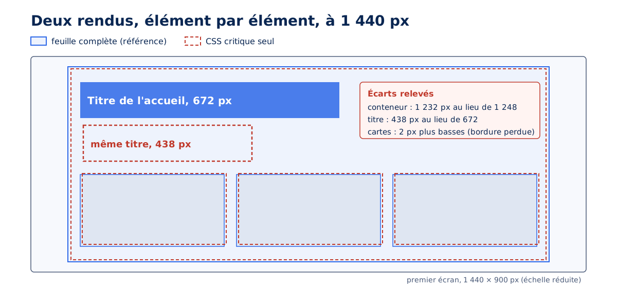
Three conditions avoid false deviations, each encountered in practice. The page is served from the site's domain, so that relative URLs and fonts resolve as in production. All declared fonts are loaded in both renderings, otherwise the comparison measures the final font once and the fallback once. The widths cover each framework tier : 375, 768, 1,280, and 1,440px on the controlled site, the last one crossing the 1,400px tier of Bootstrap 5.
The check requires a positive witness: the same check, run on a deliberately truncated critical CSS, must fail. Without this witness, a check that compares nothing (mismatched elements, empty page, wrong URL) also passes, giving false assurance. On the checked site, the witness truncated from the container rules failed on 8 out of 8 pages, with 3 to 95 discrepancies per width.
// controle-geometrie.mjs : compare le rendu « CSS en ligne seul » et le rendu « feuille complète »
// Usage : node controle-geometrie.mjs <url> [largeurs=375,768,1280,1440] (Playwright 1.56, Chromium)
import { chromium } from 'playwright';

const [url, larg = '375,768,1280,1440'] = process.argv.slice(2);
const largeurs = larg.split(',').map(Number);
const HAUTEUR = 900, TOLERANCE = 1; // premier écran contrôlé, tolérance en px

const html = await (await fetch(url)).text();
const complet = html.replace(/<script\b[\s\S]*?<\/script>/gi, ''); // sans scripts
// Même DOM dans les deux rendus : les <link> restent, seul leur rel est neutralisé
const critique = complet.replace(/<link\b[^>]*rel=["'](?:stylesheet|preload)["'][^>]*>/gi,
  (l) => (/rel=["']stylesheet["']|as=["']style["']/i.test(l) ? l.replace(/rel=["']/i, (m) => m + 'x-neutralise-') : l));

const releve = () => [...document.body.querySelectorAll('*')].map((el, i) => {
  const r = el.getBoundingClientRect();
  return { i, nom: el.tagName.toLowerCase() + (el.className ? '.' + String(el.className).split(' ')[0] : ''),
    x: r.x, y: r.y, l: r.width, h: r.height };
});

const navigateur = await chromium.launch();
let ecarts = 0;
for (const largeur of largeurs) {
  const rendus = [];
  for (const variante of [critique, complet]) {
    const page = await navigateur.newPage({ viewport: { width: largeur, height: HAUTEUR } });
    // Page servie depuis l'URL du site (route interceptée) : URL relatives et polices comme en production
    await page.route(url, (route) => route.fulfill({ contentType: 'text/html', body: variante }));
    await page.goto(url, { waitUntil: 'load' });
    await page.evaluate(async () => { // toutes les polices déclarées, puis les images
      await Promise.all([...document.fonts].map((f) => f.load().catch(() => {})));
      await document.fonts.ready;
      await Promise.all([...document.images].map((img) => img.decode().catch(() => {})));
    });
    rendus.push(await page.evaluate(releve));
    await page.close();
  }
  const [a, b] = rendus;
  const touche = (e) => e.y < HAUTEUR && e.y + e.h > 0; // coupe le premier écran
  const dedans = (e) => e.y >= 0 && e.y + e.h <= HAUTEUR; // tient entier dans le premier écran
  for (const ea of a) {
    const eb = b[ea.i];
    if (!touche(ea) && !touche(eb)) continue;
    const position = Math.abs(ea.x - eb.x) > TOLERANCE || Math.abs(ea.y - eb.y) > TOLERANCE;
    const taille = dedans(ea) && dedans(eb) && (Math.abs(ea.l - eb.l) > TOLERANCE || Math.abs(ea.h - eb.h) > TOLERANCE);
    if (position || taille) {
      ecarts++;
      console.log(`${largeur}px ${ea.nom} : critique ${[ea.x, ea.y, ea.l, ea.h].map(Math.round)} / complet ${[eb.x, eb.y, eb.l, eb.h].map(Math.round)}`);
    }
  }
}
await navigateur.close();
console.log(ecarts ? `${ecarts} écart(s)` : 'Aucun écart');
process.exit(ecarts ? 1 : 0); // témoin positif : relancer sur une page au CSS critique amputé, le code doit valoir 1
Two precautions complete the check on a real site. A template populated from the database (article, product page) shares a single critical CSS among all its instances: check at least two more instances, chosen at the extremes (longest and shortest title, with and without image). And an isolated discrepancy is replayed three times before being corrected: on a portrait checked on October 3, 2026, 20 discrepancies noted on the first pass disappeared on the next four passes, a simple variation in font rendering at the time of the check.
Should unused CSS be removed?
Only dead CSS, the kind no page uses in any state. Non-critical CSS, useful further down the page, on another template, or after an interaction, loads without blocking; dead CSS can be removed. Confusing the two breaks pages that no one has tested, often months later.
Read the coverage, and its limits
The Coverage panel in Chrome DevTools indicates, for each stylesheet, the percentage of bytes used during recording. The figure is misleading by design: it applies to one page, in one state, at one width. A stylesheet used at 30% on the homepage on desktop may be used at 60% on a product page on mobile with the menu open. Coverage indicates leads, it does not prove a rule is dead.
The risks of removal
Three families of rules appear unused but are not. Classes added by JavaScript: mobile menu, modal, active tab, form error message. Interaction states: :hover, :focus-visible, :checked, the removal of which also degrades keyboard accessibility. Rare templates: 404 page, empty search results, payment page. A rule is judged on all templates and states, by testing its selectors on each, never on a coverage snapshot.
What Lighthouse 13 says
The "Reduce unused CSS" (unused-css-rules) audit is neither among the audits replaced by insights nor among the audits removed from version 13. Checked in the default configuration of Lighthouse 13.5.0, it still exists, categorized under diagnostics with a null weight in the score. It therefore signals a lead without impacting the score, and deserves the same treatment as coverage: a starting point, to be confirmed template by template.
How does WordPress inline CSS itself?
Since WordPress 5.8, the wp_maybe_inline_styles() function inlines small enqueued stylesheets that the core knows the file for, from smallest to largest, up to the limit of the styles_inline_size_limit filter. This limit is 40,000 bytes since WordPress 6.9, compared to 20,000 previously.
How it works
According to the core documentation, only stylesheets that declare their file via the path data (set by wp_style_add_data()) are candidates: core block stylesheets have it, while extension and font stylesheets rarely do. Candidates are sorted from smallest to largest, then inlined as long as the total remains below the limit. The function runs twice, on wp_head then on wp_footer for late stylesheets, and each run has the full budget.
This double pass changes the calculation: a limit of 14,000 bytes resulted, on an article measured by the agency, in 20 KB of inlined CSS. These limits count uncompressed bytes, and on our test bench of October 15, 2026, 43.8 KB of inlined CSS weighed 7.8 KB once compressed. Lowering the limit reduces this volume, but brings out stylesheets that the core was inlining.
Tested on October 15, 2026 on WordPress 7.1.3 and GeneratePress 3.6.1, on a page rich in core blocks: without adjustment, 5 blocking stylesheets; with a limit of 7,000 bytes and the path declaration, 8; with the declaration alone, 3. The low limit rejected five block stylesheets (button, columns, table, search, latest posts) of 2.3 to 4 KB each into <link>.
Agency convention, revised after this test bench: keep the core limit and declare the path for small font and extension stylesheets that do not have it. Lowering the limit is only justified when the compressed HTML exceeds the first round trip, around 14 KB; the line remains commented out in the snippet.
<?php
/**
 * Petites feuilles mises en ligne par le cœur (wp_maybe_inline_styles).
 * Testé le 15 octobre 2026 sur WordPress 7.1.3 et GeneratePress 3.6.1.
 * Limite du cœur conservée (40 000 octets par passage depuis WordPress 6.9).
 */

// Option : abaisser la limite seulement si le HTML compressé dépasse le premier aller-retour.
// Deux passages (wp_head puis wp_footer), chacun avec le budget entier.
// add_filter( 'styles_inline_size_limit', fn() => 7000, 20 ); // priorité 20 : après une extension qui forcerait 0

// Déclarer le fichier des petites feuilles qui ne le font pas (polices, extensions).
add_action( 'wp_enqueue_scripts', 'awp_declarer_petites_feuilles', PHP_INT_MAX );
add_action( 'wp_footer', 'awp_declarer_petites_feuilles', 0 ); // avant le second passage (priorité 1)
function awp_declarer_petites_feuilles() {
	$poignees = array( 'font-titres', 'mon-extension-public' ); // à adapter au site
	$styles   = wp_styles();
	foreach ( $styles->queue as $poignee ) {
		$style = $styles->registered[ $poignee ] ?? null;
		if ( ! in_array( $poignee, $poignees, true ) || ! $style || ! is_string( $style->src ) || $styles->get_data( $poignee, 'path' ) ) {
			continue;
		}
		$src = strtok( $style->src, '?' );
		if ( 0 !== strpos( $src, content_url( '/' ) ) ) {
			continue; // feuille servie hors de wp-content : pas de fichier local
		}
		$fichier = WP_CONTENT_DIR . substr( $src, strlen( content_url() ) );
		if ( is_readable( $fichier ) ) {
			wp_style_add_data( $poignee, 'path', $fichier );
		}
	}
}
On the same bench, the declaration correctly enqueues the two targeted stylesheets. A stylesheet enqueued during wp_footer and with a path also gets enqueued on the second pass, and WordPress 7.1.3 prints its <style> in the <head>: the core brings late styles up.
What the agency measures
September 2026 measurement on WordPress 7.1.2, with GeneratePress and GeneratePerf : limit to 7 000 bytes and declared paths, an article goes from 12 to 6 blocking stylesheets, with a mobile Lighthouse performance from 94 to 95 and an LCP from 2.9 to 2.8 s. On this stack, most stylesheets did not have a path: the gain came from their declaration. The gain remains modest because the six remaining stylesheets still block. Enqueuing by the core reduces the number of requests, without replacing real critical CSS.
October 2026 measurement on the same stack (GeneratePress 3.6.1, GeneratePerf 3.1.4), with used CSS from Perfmatters 2.6.8 enqueued, original deferred stylesheets, and small excluded stylesheets enqueued: 7 to 10 KB of compressed CSS in the HTML, no more blocking stylesheets.
Mobile simulated FCP goes from 1.65 to 1.01 s on a text page, and Lighthouse performance from 98 to 100. On an article where the LCP element is a photo, from 1.7 to 1.1 s FCP, for a document that went from 26 to 39 KB transferred. Our article on Core Web Vitals on WordPress places this setting among the CMS's other projects.
How to check that your CSS no longer blocks rendering?
With three console checks and one in Chrome's Performance panel: list blocking stylesheets and their transmitted weight, compare the arrival of each stylesheet to the FCP, estimate the compressed weight of inline CSS, and identify <style> tags in the <body>. The snippets below were executed on October 15, 2026 on Chromium 141 on a local bench.
// 1. Feuilles bloquantes et poids transmis (transferSize vaut 0 pour une feuille en cache
//    ou d'une autre origine sans Timing-Allow-Origin : la peser alors avec curl --compressed)
performance.getEntriesByType('resource')
  .filter((r) => r.initiatorType === 'link' && r.renderBlockingStatus === 'blocking')
  .map((r) => ({ url: r.name, transmis: r.transferSize, decode: r.decodedBodySize }));

// 2. Le premier rendu a-t-il attendu chaque feuille ? (peintAvant: false = la feuille est arrivée avant le FCP)
const fcp = performance.getEntriesByName('first-contentful-paint')[0]?.startTime;
performance.getEntriesByType('resource')
  .filter((r) => r.initiatorType === 'link' && /\.css$/.test(new URL(r.name).pathname))
  .map((r) => ({ feuille: new URL(r.name).pathname.split('/').pop(), arrivee: Math.round(r.responseEnd),
    fcp: Math.round(fcp), peintAvant: fcp < r.responseEnd, statut: r.renderBlockingStatus }));

// 3. Poids compressé estimé du CSS en ligne du <head> (gzip ; Brotli compresse un peu mieux)
const css = [...document.querySelectorAll('head style')].map((s) => s.textContent).join('');
const gz = await new Response(new Blob([css]).stream().pipeThrough(new CompressionStream('gzip'))).arrayBuffer();
console.log(css.length, 'caractères en ligne,', gz.byteLength, 'octets compressés (gzip)');

// 4. Blocs <style> dans le <body> (hors styles internes d'un SVG)
[...document.querySelectorAll('body style')].filter((s) => !s.closest('svg') && s.textContent.trim());
The second snippet is the most informative: a stylesheet marked non-blocking whose arrival precedes the FCP may have delayed the first render, like the stylesheet at the end of the <body> described above. It runs on multiple loads and under two network conditions, fast and slow, since the proportion changes with the HTML arrival speed. In the Performance panel, no CSS request should appear between receiving the document and the first render.
For more complete control, the "Critical CSS Detection" snippet from Joan León's webperf-snippets measures inline CSS against the 14 KB budget, blocking stylesheets, preloaded stylesheets, and those targeted by media all at once. The two approaches complement each other: the snippet for the status quo, geometry control for rendering accuracy.
Where to start?
By measuring the blocking CSS delivered: under 14 KB and discovered early, a single stylesheet is sufficient; beyond that, generate critical CSS, load the rest without blocking in a per-page stylesheet, then check the geometry with a positive indicator. Order matters more than the tool.
The errors we encounter in audits almost always follow the reverse order: an extension enabled to silence an alert, critical CSS never compared to the final render, deferred stylesheets arriving one by one, and CLS climbing in the field data while lab scores improve. The LCP optimization guide shows how blocking CSS fits into the sub-parts of LCP, and our responsive guide reminds us why each width breakpoint must be checked.
Measuring the blocking CSS for each template, deciding where critical CSS is justified and checking it with each generation is the work of performance optimization; first identifying where your stylesheets are in relation to the budget is the purpose of a performance audit. In both cases, the initial question remains the criterion: does your critical CSS paint the same page as your complete stylesheet?