
Mobile Core Web Vitals are systematically worse than their desktop equivalents, on almost all sites we can audit. The slower network and more modest processors only explain part of the gap: the rest comes from so-called responsive sites that send the phone the entirety of the desktop site, simply hidden by CSS.
Responsive design is, however, the right approach, and the only reasonable one for fifteen years: the same page, the same HTML, a layout that adapts to all screen sizes. The problem is not the principle, but its common implementation, which confuses adapting the display and adapting what is sent: two very different things from the browser's perspective.
This guide covers the foundations, viewport and media queries, with code examples, then breaks down the four errors that make a site perfectly adapted visually remain slow on mobile. One question runs through it from beginning to end: is your site responsive, or just disguised as a responsive site?
What is responsive design?
Responsive design is an approach to design and integration where the same page adapts to all screen sizes from a single HTML, using only CSS. The term was coined by Ethan Marcotte on May 25, 2010, in A List Apart, and the French equivalent is site web adaptatif, or site réactif.
Three historical pillars define it: fluid grids sized in proportions rather than pixels, flexible media that adapt to their container, and media queries that adjust the layout in steps. The image aspect, from srcset to art direction, has its own guide to optimizing images for the web: this article will not revisit it, and this is an acknowledged scope choice. The foundational text, however, deserves to be reread in its original version, as it contains an idea that fifteen years have diluted.
Rather than crafting disconnected designs for each of an ever-increasing number of devices, we can treat them as facets of the same experience.
Ethan Marcotte, independent designer and integrator, in his foundational article "Responsive Web Design" published in A List Apart on May 25, 2010
What is the difference between responsive and adaptive?
Responsive is fluid and continuous: the layout recomposes itself at any width, without breaking. Adaptive design relies on fixed templates served in stages: three or four frozen layouts, activated according to the detected width. The distinction dates back to 2011 and today leans decidedly in favor of fluid responsive, which is more robust in the face of screen diversity.
A third variant, server-side adaptive, which sends different HTML depending on the device, will be discussed later with legacy issues, as it poses specific caching and maintenance problems. Before getting there, a crucial point: responsive does not mean lightweight. A site can display perfectly on a phone and send it three times what it needs, and that's the whole point of what follows.
How to make a site responsive?
Four steps are sufficient, in this order: set the viewport meta tag, build the layout with fluid grids using relative units, adjust breakpoints with media queries, and make media flexible. On a modern CMS, recent themes provide this foundation, and the real work focuses on what we add to it: menus, sliders, and duplicated blocks.
The related issue of images deserves a short answer: an image becomes responsive with a fluid width and automatic height in CSS, then variants served according to the screen via srcset. The details of these mechanisms, including modern formats, belong to the image guide mentioned above, leaving this guide to focus on the part nobody addresses, the cost. It all starts with a single-line tag.
What is the viewport meta tag for?
The viewport meta tag tells the mobile browser to set the rendering width to the actual screen width, with an initial scale of 1. Without it, mobile browsers render the page in a virtual window of about 980 pixels and then shrink it, a compatibility mode inherited from the pre-mobile era.
<meta name="viewport" content="width=device-width, initial-scale=1">This canonical value, documented on the MDN reference for the viewport meta tag, is sufficient in almost all cases. The additions still encountered, user-scalable=no or maximum-scale=1, should be avoided: they block zooming, which constitutes a clear accessibility defect for anyone with visual impairments, with no performance benefit in return. No media query works correctly without this tag, as the evaluated width would be the virtual window, not the screen.
Why does 100vh cause problems on mobile?
The vh unit measures the viewport height, but mobile browser interface bars appear and disappear on scroll : 100vh corresponds to the largest window, so an element fixed to it overflows the screen when the bars are visible. The dvh, svh, and lvh units, standardized to fix this, have been available in all major browsers since late 2022.
.panneau {
  height: 100vh;  /* repli : hauteur figée sur la plus grande fenêtre */
  height: 100dvh; /* hauteur dynamique : suit les barres du navigateur */
}
The two successive declarations form a clean fallback : an old browser ignores the second line, a modern browser applies it. The exact support status can be checked on the viewport units variants table, and the choice depends on the use case : svh to ensure an element always fits on screen, dvh to follow the bar in real-time, keeping in mind that dvh changes value on scroll and can cause continuous layout recalculations. These units are evaluated in media queries, which it is time to set up properly.
How do media queries work ?
A media query is a CSS condition that applies a block of styles when the environment satisfies it : window width, orientation, user preferences. Range notation, like width >= 48rem, has been supported by all major browsers since 2023 and finally makes bounds readable.
/* Syntaxe classique */
@media (min-width: 48rem) {
  .grille { display: grid; }
}

/* Notation de plages, equivalente et plus lisible */
@media (width >= 48rem) {
  .grille { display: grid; }
}

/* Un intervalle sans chevauchement possible */
@media (48rem <= width < 64rem) {
  .grille { grid-template-columns: 1fr 1fr; }
}
Writing bounds in rem rather than pixels follows the user's text size setting, which adapts the layout to people who enlarge their font. Width is not the only useful condition, by the way : orientation, hover, and pointer detect the type of interaction, and prefers-reduced-motion allows disabling animations for those who request them reduced, an accessibility consideration that also avoids costly animations on modest devices. The support status for range notation can be checked on its caniuse table.
How many breakpoints should be planned ?
As few as possible, placed where the content breaks, never at device sizes. The list of " iPhone breakpoints " to maintain is an anti-pattern : market screen sizes number in the hundreds, and a breakpoint is discovered by stretching the window until the layout degrades.
Two or three major breakpoints are sufficient for most sites, supplemented by a few local adjustments per component. The meaning of the boundaries, min-width or max-width, engages the entire CSS architecture: it is the entry point for the mobile-first distinction, discussed later. One last fact is worth noting before the core of the subject, as almost no one knows it: a stylesheet linked with a non-matching media attribute is still downloaded, but without blocking rendering, at low priority, as documented by the web.dev guide on non-critical CSS. This mechanism underlies one of the major fixes that follow.
The four symptoms of a falsely responsive site
A falsely responsive site is one that displays correctly at all screen sizes, but charges each device for the interfaces of others. The diagnosis consists of four recurring symptoms, observed in audits across all platforms: duplicated DOM, un-conditional CSS, masked but downloaded resources, and single JavaScript initializing two interfaces.
Each symptom here follows the same reading grid: what we observe, what it costs and on which metric, how to detect it, how to fix it. The four accumulate on the same pages, and it is their addition that explains the systematic gap between mobile and desktop observed in field data.
The duplicated and masked DOM
The cardinal symptom can be observed in two minutes in the inspector: two complete headers in the HTML, a desktop navigation bar with its mega-menu and a mobile drawer that duplicates the same menu, each hidden with display:none at the other breakpoint. The pattern repeats on columns declined as "mobile version / desktop version", tables doubled with a card version, and sliders duplicated per device, a flaw that we have already documented on the most duplicated component on the web, the slider and its variants.
The cost mechanism can be summed up in one sentence: display:none removes from rendering, not from the document. The HTML is transferred and parsed, nodes are built, CSS rules are matched against each node, and each interaction then pays for the style recalculation on the entire tree, as explained by the web.dev article on DOM size and interactivity. The metric that takes the hit is INP, whose optimization is the subject of a dedicated guide: the corresponding Lighthouse audit issues a warning beyond 800 nodes and an alert beyond 1,400, thresholds documented by the Chrome team.
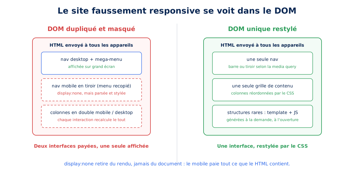
The SEO component has worsened the situation since Google completed its switch to mobile-first indexing, announced as complete on October 31, 2023: mobile HTML is the indexed version. The consequences are symmetrical: content removed from the mobile version disappears from the index, and a duplicated DOM sends Google an artificially inflated document where useful content gets diluted.
Page builders are the most documented case of this flaw, with their "hide on mobile" options that only add display:none and their device-specific columns. The problem goes far beyond WordPress: PrestaShop themes duplicating their blocks, custom integrations rushed by deadlines, email templates recycled into pages. The hiding option is not the problem in itself: it is its use as a tool for designing parallel interfaces that creates the falsely responsive site.
Detection only requires the browser, and four steps are enough to establish the complete diagnosis in under ten minutes:
- count the nodes in the console with
document.querySelectorAll('*').length, at both window sizes; - compare the HTML served to the mobile viewport and the desktop viewport, which should be identical and rarely is;
- search for blocks in
display:nonecontaining duplicated content, starting with the header; - run Lighthouse's DOM size audit, which lists the densest areas of the tree.
Correction follows a strict order of preference, and the first reflex covers the vast majority of cases: a single markup, restyled by CSS. The same nav element becomes a drawer or a horizontal bar depending on the viewport, and no content exists in duplicate in the document.
<nav>
  <button class="nav-bouton" aria-expanded="false" aria-controls="menu">Menu</button>
  <ul id="menu" class="nav-liens">…</ul>
</nav>

.nav-liens {            /* base : tiroir mobile */
  position: fixed;
  inset: 0;
  transform: translateX(100%);
  transition: transform 0.2s;
}
.nav-liens.ouverte { transform: none; }

@media (width >= 64rem) {  /* grand ecran : barre horizontale */
  .nav-bouton { display: none; }
  .nav-liens {
    position: static;
    transform: none;
    display: flex;
  }
}
The trigger is a real button with aria-expanded, not the old checkbox hack, and the details element provides a JavaScript-free alternative for simple menus. When the structure truly needs to differ between devices, secondary markup is generated on demand, a template element cloned in JavaScript on first opening. Two properties complete the arsenal: content-visibility reduces the rendering cost of off-screen blocks, honestly stating that it does not prevent download or parsing, and the inert attribute removes the closed drawer from tab order and screen readers. The Popover API, now available in all browsers, natively handles the opening and closing of these panels.
A final point concerns the header itself: fixed bars cover the content and cause layout shifts when they appear, counted in the CLS, the mechanism of which is detailed in the dedicated guide. The short rule: position:sticky reserves its space in the flow while position:fixed removes it, and a mobile menu, burger or not, must open its drawer without ever shifting the content below it. With this clean DOM, the remaining task is to stop delivering all CSS to everyone.
Unconditional CSS
The second symptom is a single stylesheet that includes all three layouts: the mobile downloads and parses the desktop grid, the desktop downloads the mobile drawer styles, and sites using frameworks add everything that is not used anywhere. Since CSS blocks rendering, every kilobyte delays the first display, thus the LCP, the optimization of which is detailed elsewhere: on mobile, it is the critical rendering path that lengthens.
<!-- Avant : tout le CSS bloque le rendu de tous les appareils -->
<link rel="stylesheet" href="styles.css">

<!-- Apres : trois feuilles, seules celles qui correspondent bloquent -->
<link rel="stylesheet" href="base.css">
<link rel="stylesheet" href="mobile.css" media="(max-width: 47.99rem)">
<link rel="stylesheet" href="desktop.css" media="(min-width: 48rem)">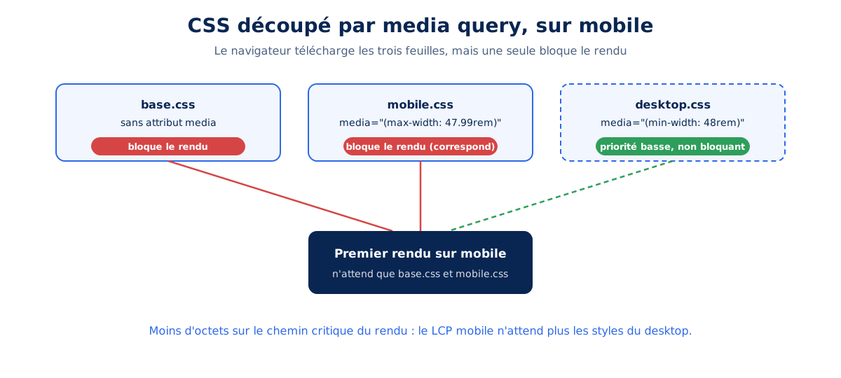
This breakdown precisely exploits the fact stated earlier: the browser downloads the three stylesheets, but only the one whose media matches blocks rendering. The benefit is therefore not in the transferred bytes, but in the bytes placed on the critical path, those that the initial display awaits. Critical CSS per viewport, which inlines styles above the fold, pushes the logic further; its maintenance is real and the approach is only justified on stable, high-traffic templates.
CSS frameworks deserve numbers rather than a trial, and we measured them on August 26, 2026. The complete bootstrap.min.css from Bootstrap 5.3.3 weighs 232,803 minified bytes, or 30,777 bytes compressed with gzip; passed through PurgeCSS against a typical complete page, including navigation, grid, card, table, and form, it drops to 24,598 bytes, or 5,549 compressed. In other words, nearly 90% of the stylesheet is never used on a representative page: the framework itself is not slow, its default build is.
Tailwind takes the problem backwards by only generating the classes used, which, according to its official documentation, results in final stylesheets under 10 KB compressed, at the cost of HTML bloated with utility classes: the weight shifts to the document, which leads back to the previous symptom. The Coverage tab in DevTools measures your own case by listing the CSS never executed in the current viewport: on the sites we audit, this unused portion regularly exceeds half the stylesheet on the mobile viewport, and this is the first figure to note before any redesign of the integration.
Hidden but downloaded resources
The third symptom groups desktop slider images loaded on phones, background video downloaded then hidden, map iframe instantiated in an invisible block, and font weights retrieved for a mega-menu that will never be displayed. The intuition "it's hidden, so it's not loaded" is false in most cases, because the behavior depends on the type of resource and the method of hiding.
The underlying reason lies in how the browser works: the preload scanner, documented by web.dev, parses the raw HTML and initiates image downloads even before the CSS is applied: an img tag is fetched regardless of its future visibility. Background images, on the other hand, depend on style calculation, with the subtleties measured by Tim Kadlec in his benchmark tests published in April 2012, the lessons from which structure the summary table below, compared to current documented behaviors.
| Resource | Element hidden with display:none | Parent hidden | Reliable workaround |
|---|---|---|---|
Image (img tag) | Downloaded (preload scanner) | Downloaded | Conditional markup, lazy loading (images guide) |
| CSS background image | Downloaded | Not downloaded | Define it only in the relevant media queries |
@font-face font | Varies by browser | Varies by browser | Declare only the weights actually displayed |
| Video and its poster | Poster downloaded, stream according to preload | Same | preload="none" and load on interaction |
| Iframe | Loaded and executed | Loaded and executed | loading="lazy" and clickable facade |
The background line holds the most profitable rule: a decorative background reserved for desktop should be declared in a min-width media query, never as a base with masking on top. Doubt should always be resolved by measurement, with the network panel open to both viewports, as these behaviors have evolved and still vary between engines on edge cases, with the font line being the most prominent.
/* Avant : telechargee partout, meme masquee sur mobile */
.hero { background-image: url(hero-large.avif); }

/* Apres : demandée uniquement quand elle sert */
@media (width >= 64rem) {
  .hero { background-image: url(hero-large.avif); }
}
Iframes are handled by a facade : a clickable static image replaces the embedded map or video, and the actual iframe is only instantiated upon interaction. Fonts follow the same principle of sobriety, loading only the weights actually displayed in the current viewport, a topic extended by our analysis of the impact of fonts ; the rest of the image section, formats, srcset, and art direction, falls under the aforementioned image guide, which is sufficient. The fourth symptom remains, the most costly in terms of interactivity.
A single JavaScript for two interfaces
The last symptom is evident in the bundle : the same file initializes the desktop mega-menu and the mobile drawer, instantiates a slider on a hidden block, and attaches resize listeners that continuously recalculate. The mobile device pays the price for parsing and executing all this code on a modest processor : Lighthouse even emulates a Moto G Power with a 4x CPU slowdown, as documented by its official throttling page, precisely to represent this mid-range device.
const mq = window.matchMedia('(width >= 64rem)');

function initSelonViewport(e) {
  if (e.matches) {
    initMegaMenu();      // uniquement quand la barre desktop existe
  }
}
mq.addEventListener('change', initSelonViewport);
initSelonViewport(mq);

// Le code du tiroir mobile n'arrive qu'a la premiere ouverture
bouton.addEventListener('click', async () => {
  const { ouvrirTiroir } = await import('./tiroir.js');
  ouvrirTiroir();
}, { once: true });
Two mechanisms carry the entire correction. matchMedia and its change event replace the resize listener, which triggers dozens of times per second during a simple screen rotation, whereas the former only activates when the breakpoint is actually crossed. Dynamic import then defers the code for each interface until it's needed : the mobile drawer costs nothing until it's opened, the mega-menu doesn't exist on a phone. Third-party scripts follow the same discipline, not loading widgets for invisible blocks on mobile, an entire area covered by our guide to reducing the impact of third-party JavaScript. With these four symptoms corrected, one methodological question remains : the famous mobile-first.
Is your site as fast as your visitors expect?

Does mobile-first apply to CSS or design?
Both, and they are two distinct practices that should neither be confused nor prescribed for each other. Mobile-first CSS is a writing technique, with base styles for small screens enhanced using min-width ; mobile-first design is a project methodology, born in 2009, that prioritizes content for the small screen first.
/* Base : le petit ecran, sans media query */
.fiche { display: block; }

/* Enrichissement progressif vers le grand ecran */
@media (width >= 48rem) {
  .fiche {
    display: grid;
    grid-template-columns: 1fr 2fr;
  }
}
The benefit of mobile-first CSS is precisely formulated: the simplest cascade is served to the most constrained device, and we avoid the debt of cancellations, those max-width blocks that spend their time undoing the desktop. What the technique doesn't do deserves to be said just as clearly: the CSS is downloaded in its entirety in all cases, and the benefit is structural, not weight-related. A poorly cut mobile-first file weighs exactly the same as a poorly cut desktop-first file.
Design mobile-first operates on another level: it's what prevents duplicate DOM. When the mobile is an afterthought, a reduction of the desktop, duplication is the easy solution that becomes necessary during integration; when the content hierarchy is decided for the small screen first, a single markup is naturally sufficient. Therefore, you can write mobile-first CSS on a desktop-first designed site, and this is precisely the typical profile of a falsely responsive site. One last clarification, regarding the mobile-first indexing mentioned earlier: thinking mobile first never means impoverishing the mobile, as content parity is now a SEO issue as much as an experience one.
Do we still need an m. version of our site?
No, no use case in 2026 justifies a separate m. domain, and the answer applies to the entire family of two-version approaches. The structural cost is documented: bifurcated URLs, device detection redirection that adds a network round trip before the first resource, maintenance of annotations on both sides, diluted SEO signals.
The m. domain requires redirecting every mobile visitor arriving at a desktop URL, at the cost of a jump whose mechanics and cost are detailed in our guide to HTTP status codes. The clean exit exists and can be summarized in one line: 301 redirects from each m. URL to the corresponding single responsive URL, then the death of the subdomain. Dynamic serving, same URL but different HTML depending on the User-Agent, is the server-side adaptive approach mentioned earlier: it fragments the cache via the Vary header, and its agent sniffing has become more fragile each year since the reduction of User-Agent information in favor of Client Hints.
AMP is closing the door on legacy. The format required a parallel set of pages in exchange for a spot in the Top Stories carousel ; this requirement was lifted with the June 2021 Page Experience update, which opened the carousel to any page regardless of its format. The ecosystem has since died out, and maintaining AMP pages in 2026 means paying twice for each template for a benefit that has disappeared. Separate mobile themes, outdated WordPress plugins, or mobile themes still active on PrestaShop stores fall under the same cross-platform verdict: a single HTML base, restyled.
One question often comes up subtly regarding this legacy: does Google penalize non-responsive sites? The answer is indirect but very real. There is no penalty for non-responsiveness in itself; however, indexing has been done on the mobile version since late 2023, and page experience signals include Core Web Vitals measured on mobile: a site that is difficult to use on a phone therefore accumulates poorly indexed content and degraded signals, without any formal penalty needing to exist. Fortunately, the present offers much finer tools than these duplicate versions.
What modern techniques complement media queries?
Four recent CSS tools reduce the need for breakpoints themselves, complementing media queries rather than replacing them. Fluid typography via clamp is the most accessible example, with a size that continuously slides between two limits :
h1 {
  /* minimum 1.5rem, preferee 1.1rem + 2vw, maximum 2.5rem */
  font-size: clamp(1.5rem, 1.1rem + 2vw, 2.5rem);
}
The gain goes beyond aesthetics: fewer steps mean fewer layout shifts when crossing breakpoints, thus better visual stability. The minimum limit in rem keeps the text scalable, and the vw component is calculated so that the transition remains smooth between the two extremes : a fluid typography generator performs this calculation in seconds.
Container queries change the scale of reasoning: the component adapts to the width of its container, not the width of the window. A product card automatically switches to a horizontal layout when its column allows it, whether it's in a narrow sidebar or a main area, making it the natural tool for design systems. Support is available in all browsers since early 2023, a status verifiable on the dedicated caniuse table, while keeping media queries for the overall page structure.
.colonne { container-type: inline-size; }

@container (width >= 30rem) {
  .carte {
    display: grid;
    grid-template-columns: auto 1fr;
  }
}

/* Grille intrinseque : s'adapte sans aucune media query */
.galerie {
  display: grid;
  grid-template-columns: repeat(auto-fit, minmax(16rem, 1fr));
  gap: 1rem;
}
The intrinsic grid of the second block illustrates the general direction: auto-fit and minmax produce a gallery that recomposes itself at any width without a single condition, which mechanically reduces the temptation to duplicate device-specific variants. The rem and em units complete the set by respecting the user's text size setting, and aspect-ratio reserves space for media before it loads, a lever for stability whose details belong in the image guide. All of this is quickly written; however, one must still check what a phone actually receives.
How to test if a site is truly responsive?
Google's Mobile-Friendly Test tool and the Search Console's Mobile Usability report were retired on December 1, 2023, a removal announced by Google in April 2023. Their replacements are Lighthouse for the lab, CrUX data segmented by device for the field, and testing on a real phone, which is irreplaceable.
The classic pitfall of emulation deserves to be named: the DevTools device mode simulates the viewport, not the processor or the network. A site that runs smoothly on a fiber-optic workstation can collapse on the web's median device, and this is what the calibrated Lighthouse emulation mentioned above corrects: viewport, network, and processor throttled together, for a representative measurement of a real mobile device rather than a narrow desktop. A three-year-old mid-range Android phone, kept in the office for testing, remains the ultimate judge: it reveals scrolling stutters and first-tap delays that no emulation can faithfully reproduce.
The complete diagnosis of false responsiveness is then performed step by step, each step producing a comparable figure from one audit visit to the next:
- compare the transferred bytes at the two viewports in the network panel, the legitimate difference should remain small;
- count the DOM nodes at the two sizes and compare the result to Lighthouse thresholds;
- run the Coverage tab on CSS and JavaScript in the mobile viewport to measure the unexecuted portion;
- filter the network panel for images and iframes loaded but not visible on screen;
- contrast the site's mobile and desktop CrUX data to objectify the difference experienced by visitors.
Each of these actions corresponds to a symptom of the heart of this guide, and their sequence takes an hour on a medium-sized site. Tracking over time falls to synthetic testing tools with mobile profiles and continuous monitoring, and the measurement fundamentals are gathered in our list of optimization tips : typical responsive regression stems from a menu redesign or a new slider, precisely the components that no one re-measures after going live. A budget of nodes and bytes per template, verified with each evolution, transforms this spot check into a permanent safeguard.
An adaptation judged by bytes, not by screen
Fifteen years after the founding article, responsive design has won the display battle and, on many sites, lost the sobriety one. CrUX data reminds us each month : the gap between mobile and desktop doesn't close by adding breakpoints, it closes by ceasing to send phones interfaces they will never display.
The good news in this report is that everything is measurable: a DOM can be counted, a stylesheet weighed, a hidden resource seen in a network panel. The responsive design of the coming years will be played out less in media queries than in this discipline of sending just enough, where container queries and intrinsic grids make duplication unnecessary : sites that understand this early will approach each new generation of devices with a head start already paid for.